Guosen Chen
The photographer we're going to talk about today is Jeff Wall. I imagine some of you have heard of him? Even if you haven't seen his photographs yourselves, perhaps the name rings a bell? Oh, only two of you here have heard of him.
I. An Introduction to Jeff Wall and His Work
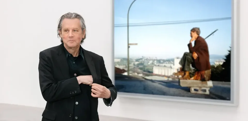
Let me give a brief introduction. Jeff Wall is a Canadian photographer. He first worked in conceptual art in the 1960s and '70s, but he later found that kind of art too boring. To him, it was hollow and pretentious, not the kind of thing he admired. So he stopped making art, and as I recall the break lasted about seven years. What did he do during those years? A Canadian living in Vancouver, he went to the Courtauld Institute of Art in London, where from 1970 to 1973 he did doctoral research under T.J. Clark, the renowned scholar of Manet and modern art. Only after that did he return to making photographs.
To put it a bit hyperbolically, Jeff Wall is, to this day, the most interpreted photographer in art history, bar none. Open any authoritative history of modern art, such as H.H. Arnason's hefty History of Modern Art, and among the few photographers it includes, Jeff Wall is right there, alongside photographers like Cindy Sherman. The scholarly literature on him is so vast that you could fairly call it voluminous, which is a very rare phenomenon in photography studies.
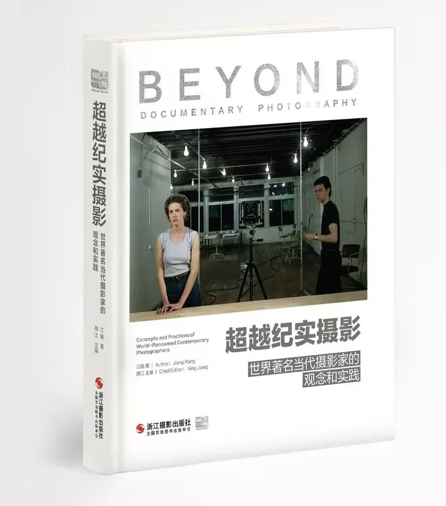
If you're interested in him, take a look at Rong Jiang's Beyond Documentary Photography. Its cover is Jeff Wall's signature work, Pictures for Women, and the book has a chapter devoted to his basic methods and ideas. If today's talk piques your interest, you'll find more in-depth material there.
So we can simply position Jeff Wall as a canonical figure in contemporary art photography, roughly the Manet or the Cézanne of photography. He has a very interesting trait that sets him apart from the vast majority of photographers: each of his photographs is an independent, complete work in itself. Many photographers we know habitually shoot a series, a photobook, or a project, but he doesn't work that way. Almost every one of his photographs is absolutely self-contained. We originally planned to look closely at three photographs today, but given the time, we may only get to one in depth. This may sound exaggerated, but I've tried it: interpreting just one of his photographs can take about an hour and a half. And that hour and a half covers only looking at the image, analyzing its composition, and working out what he's trying to convey. It doesn't go far into more abstract theory or other approaches from art history, although his work could certainly be interpreted along those lines.
So what exactly is his method? What is it that sets him so far apart from so many other art photographers?
Put simply, it's "staging." In photography's pecking order, though, "staged" usually ranks fairly low. When you see a stunning photograph and later discover it was entirely set up, your trust in it and that initial emotional response both seem to take a hit. So why is it that every photograph this artist makes is a so-called "staged" work, and yet through this very method he has made his way into the pantheon of modern art history, appearing in the same books as masters like Manet and Cézanne?
II. A View from an Apartment
This is the first photograph I want to show you today. It's called A View from an Apartment. It isn't our main focus, but it serves as a lead-in to help you get an initial sense of how his method works. I'm especially grateful to Jeff Wall for kindly allowing me to use the original images of the photographs I'm analyzing today.
At first glance it's a typical interior, much like the domestic interiors in 17th- and 18th-century Dutch genre painting, only cleverly transplanted into a modern urban setting.
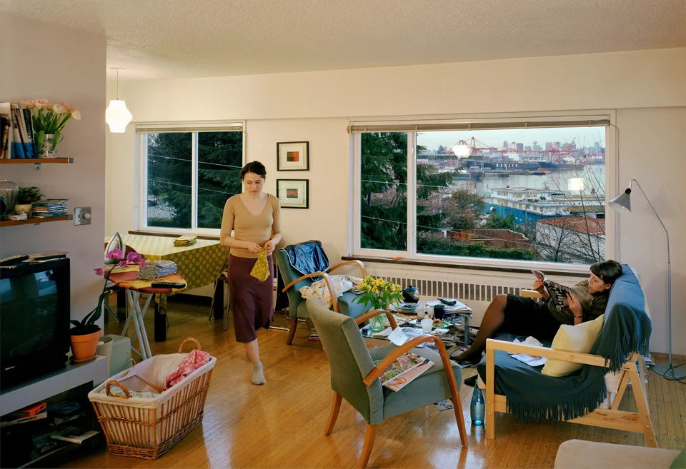
Today I'll guide you through looking at these photographs. In other words, I'd like to invite you to search with me for the points of uncertainty in these images.
2.1 Set-Building and Traces of Staging
Since I've already told you that all his work is staged, let me first ask: what details tell you this photograph is staged? Is there anywhere that strikes you as obviously designed, or as clearly post-processed?
Audience member
It's daytime, but the lights inside are on and very bright.
Guosen Chen
The lamp is indeed a key point. Anything else? Let's not rush to interpret what he's photographing. Let's first play a game of "spot the difference" and see what's off in the picture. In fact, this work is composited from a great many negatives. But I've tried, and I can't see any trace of the stitching at all, so there's no need to hunt for seams. The traces of his cinematic, set-built staging aren't exposed through technical flaws but through other, very clever means. The whole thing is like a magician's performance.
Audience member
There's very little difference in brightness between inside and outside. Normally, if the interior is properly exposed, the view out the window should be overexposed.
Guosen Chen
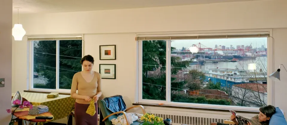
Exactly. The projection introduces some color shift, but we can still roughly see that the sky outside is a pale blue. That puts the time at around dusk, but not yet the "blue hour," the brief moment after the sun has fully set. At that time of day, anyone who has used a camera knows that in an interior lit by only three lamps (according to the image, there really are three: the brightest in the upper left, and two more reflected in the window on the right), it's actually impossible to balance the interior and exterior exposures this evenly when shooting out. If the interior is fully exposed, the window will be badly blown out; conversely, if the window is properly exposed, the interior will be plunged into darkness. This is an obvious contradiction.
The second key point is that almost all of Jeff Wall's photographs have a deep-focus effect. From the very foreground (imagine the camera is placed right here, so this is the object closest to the lens) all the way to the far distance, such as that ship out there, everything is in focus. If you tried to shoot this directly with a camera, even stopping down to f/64, it would be almost impossible to achieve. It is sharp from front to back throughout. These two are probably the easiest "giveaways" to spot.
Someone just mentioned the lamps, and that's right. In fact, at a minimum, this photograph was made by shooting the interior and exterior separately and then compositing them. But he's particularly good at a technique magicians call "misdirection." A magician uses a big, showy gesture to grab your attention, while the little mechanism that actually makes the trick work is cleverly hidden elsewhere. It's the big move covering the small move, and the magician's gaze deliberately steers you toward the big move to conceal the small one. In this photograph, the "big move" is actually the reflections of those two lamps.
Think about it: when the light outside is dim, the glass will inevitably reflect the room. But here he keeps only the reflections of two lamps. It's like a strong hint telling your brain, "This window is a real window." Think about it in reverse: if those two reflections disappeared, the picture would lose the feel of glass, and you might suspect it was just an empty window frame with no pane. Yet he adds the reflections of those two lamps, and we can't see the actual lamps anywhere in the room; we can only see the one in the upper left. He uses this detail to "trick" your brain into being sure "there's a window here." But in fact, the view outside and what the glass reflects may have nothing to do with this interior space. (In reality it should match the actual situation.) You have no way of knowing where he shot it. He may well not have shot it in a single location at all. Perhaps he simply found an ideal vantage point for the exterior view, composited the interior and exterior, and then cleverly added the two lamp reflections to lure you into believing the scene was photographed for real.
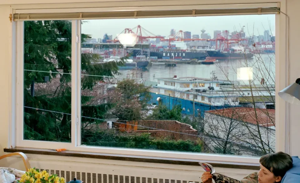
Of course, we can find plenty of other evidence.
The making of this work is itself quite interesting. It was shot in 2004–2005. Some of Jeff Wall's photographs take one or two years to make, and some take as long as three or four. This one took him at least two years. He first spent a long time searching all over Vancouver for an apartment with the view he had in mind. When he found this apartment and liked the view, he signed an open-ended lease with the landlord, because he needed the space for the long term. Then he started looking for performers. He wanted a young woman with the kind of presence he envisioned, and the one he chose is the woman on the left: an art student in her early twenties. Wall told her that she was his collaborator, not merely a subject or a model. So he gave her a budget and let her furnish and decorate the apartment according to her own taste, within the means of a real woman in her situation. He also encouraged her to spend as much time in the apartment as possible, so that the space would feel as little like a stranger's place to her as possible.
Then they discussed it further and decided she couldn't be alone in the picture; someone else was needed. So Wall had her find a close girlfriend, or a good friend, to live in the room with her. She brought in the woman on the right, lying on the sofa reading. The next question was: what should these two women be doing in the image? The only thing Wall was sure of at the time was that one of them should be ironing napkins or doing some similar household chore.
After all that, Wall began shooting. The shoot lasted about two weeks, because he had the two women repeat their actions over and over to get the effect he wanted. As we just said, he realized the ideal moment was dusk, but because of technical limitations he had to shoot in separate parts to balance the exposure. Finally he composited them digitally on a computer; the image we see is assembled from a large number of negatives. From renting the apartment to the finished picture, the whole project took more than two years.
2.2 Interpreting the Theme: Reflection, Refraction, and Mise-en-Abyme
Beyond all this, if we look at the photograph in terms of its technical arrangements, what is its expressive power? In other words, he built such an enormous staged production, with every element in the picture precisely controlled and placed. There must be something he wants to express. What is it?
On the surface, the picture shows two young people. One is holding a cloth and seems to be doing housework; the other is curled up on the sofa at right, reading what looks like a fashion magazine, and the magazine was deliberately chosen by the artist too. When interpreting Jeff Wall's photographs, we must always remember that every detail is the product of careful design. Otherwise a photograph couldn't take so long to make. We can see a magazine showing here. It's i-D, and I looked it up: it should be the July 2003 issue. It's a magazine devoted to British punk and new wave culture; i-D stands for that rebellious, authentic youth subculture born on the street. Its title, "i-D," looks like a winking emoticon, so the cover models usually strike a wink. It's a magazine focused on the pop culture and rebellious style of its time. And what the reclining woman is reading is also something leaning toward fashion and interior design.
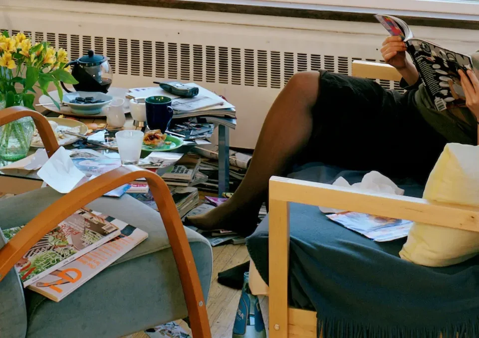
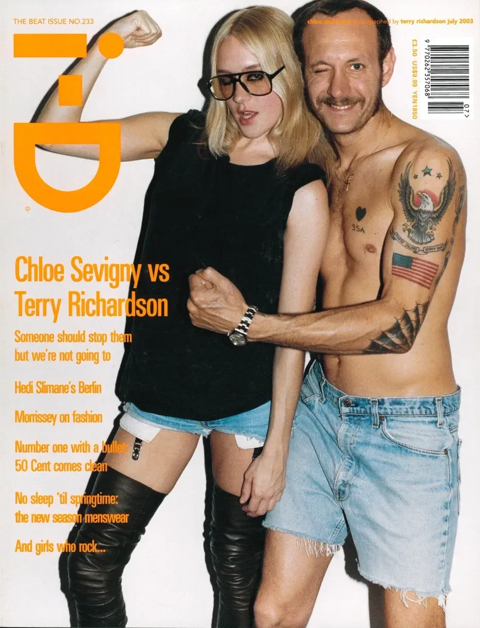
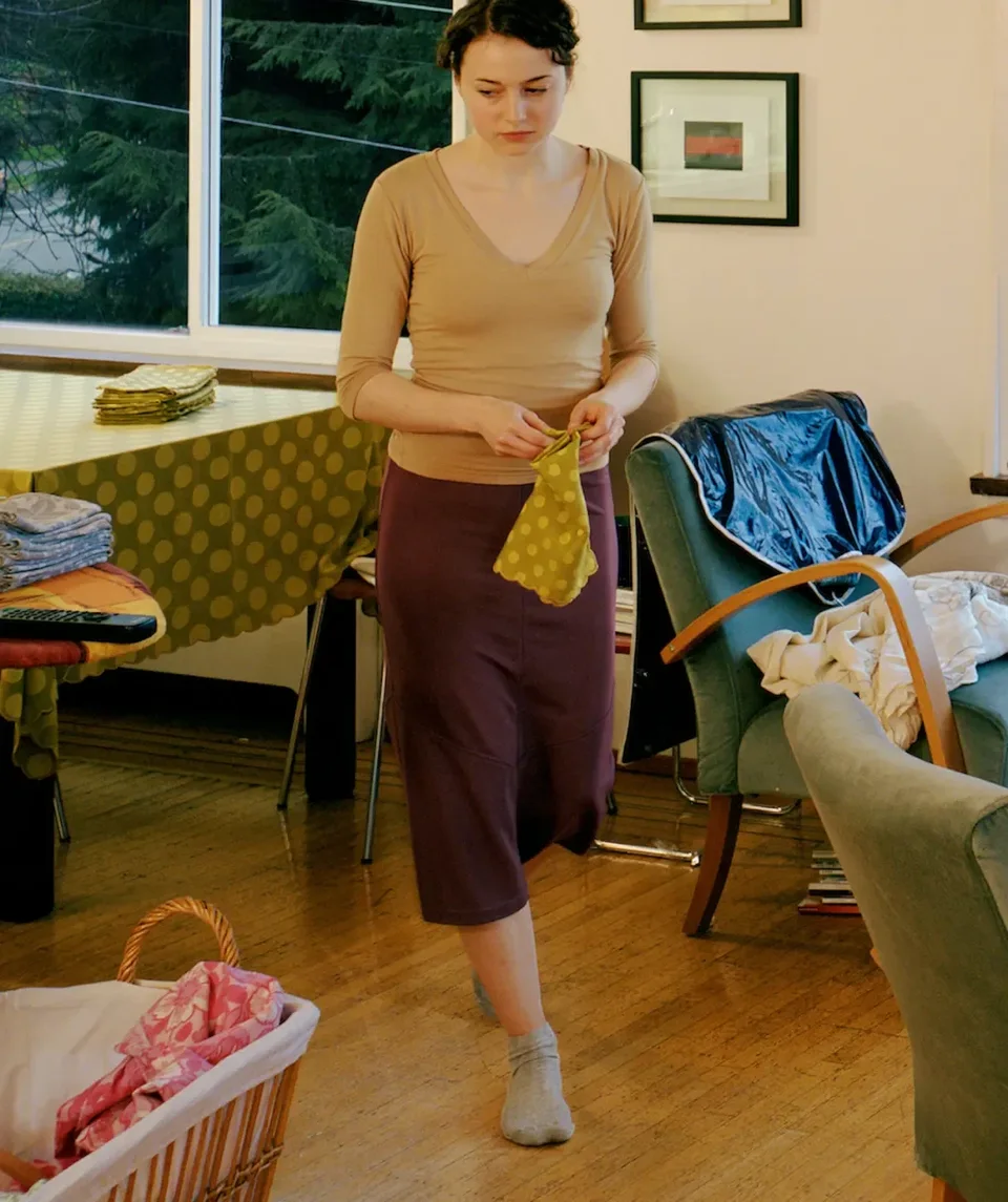
But the more interesting thing is that when I was carefully examining the standing woman on the left the other day, I began to have some doubts. Look at her feet. Her left foot is planted on the floor, while her right foot seems somewhat blurred, though not all that clearly so; when you view the image at a smaller size, it does look blurred. This clearly suggests she's walking. But think about it: would the cloth in someone's hand look like this while they're walking? Look at these two lines at the top of the cloth. They're very obvious, deliberately pressed creases. If you were really about to clean, would the cloth in your hand look like this? First, would it be this clean? Second, would its lines be this crisp? It even has a corner specifically folded, right?
Next, her gaze is directed over here. Over there there should be a laundry basket, but again you don't know what she's really looking at.
At this point I think I should explain something: to understand this photograph better, we need to know that all of Jeff Wall's works share a very particular physical mode of display: the lightbox. A lightbox is like the advertising displays you see at bus stops, with fluorescent tubes inside and the image on the front. That's how his works are presented.
The second point is that they're enormous. What I'm showing here is far too small. The original of this photograph is roughly 0.75 times bigger again than the screen in front of me: 244 cm on the long side and 167 cm on the short side. Installed in a gallery, it sits at about eye level. Let me show you how it looks installed. This is what it looks like in the gallery.
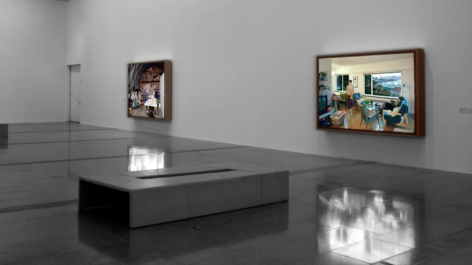
When we stand before the original in the gallery, you notice something quite remarkable.
First, the lightbox itself forms a huge frame, and as you stand in front of the work, you notice that inside the picture there's a smaller window with the same proportions as the outer frame: the window in the picture. This means that there is, first of all, a surface-level nested structure here: a mise-en-abyme.
Second, I think if we set aside the photograph's sociological themes (youth culture, furniture, urban life, industrialization, and so on), its core theme at the level of medium and technique is very clearly "reflection" and "refraction" (which is also inherent in the idea of mise-en-abyme). Why do I say this?
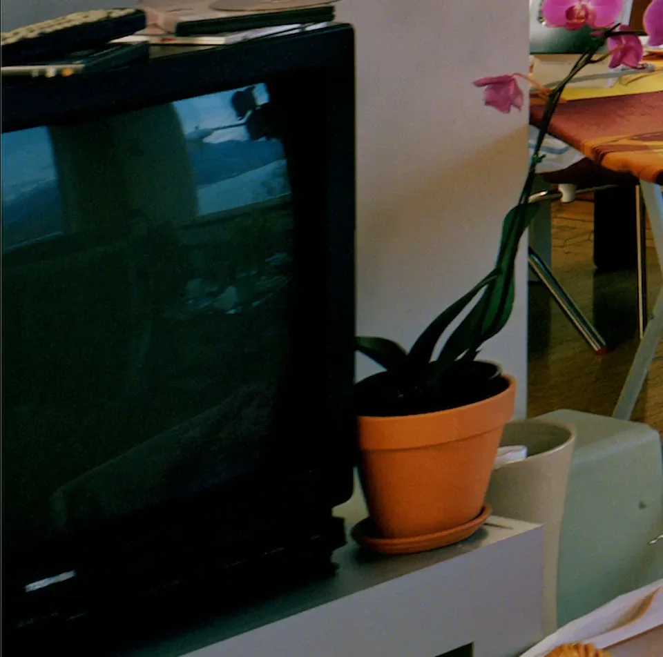
First, there's a television in the lower left. The image of the television appears very rarely across Jeff Wall's entire career, and when it does, it usually carries a critical edge. Here, though, there's no real critique, which is a very unusual case. We can see the view out the window reflected in the TV screen, right? That's a reflection.
Now look at the floor. This gleaming, glossy wooden floor also reflects the view outside, at least according to the image. But in fact that may not be the case. The light source might just be a beam he aimed in from outside in the studio, or it might be real. Either way, its purpose is simply to make you feel this is a genuine reflection. So you'll find that when we look at the lightbox, because his photographs are self-illuminated, unlike prints, which rely on reflecting external light, the HDR (high dynamic range) effect becomes extraordinarily pronounced. Put simply, the lamps in the picture and their reflections have an extremely strong presence. That's basically what it feels like to see his originals, only at a reduced size here.
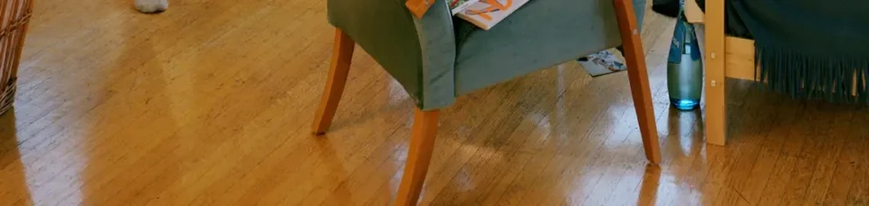
Imagine: what you're actually experiencing is light emitted outward from inside the lightbox, from the tubes; but at the same time the image tells you the light sources are inside the space on this side of the window. So here, too, there's a nesting relationship concerning where the light comes from.
Going further, when you look at it in the gallery, your own reflection is cast onto the surface, because his photographs are covered with a sheet of acrylic, and even with the tubes behind it, it still reflects your own image. So overall, I think the basic technical theme of this photograph is "reflection" and "mise-en-abyme."
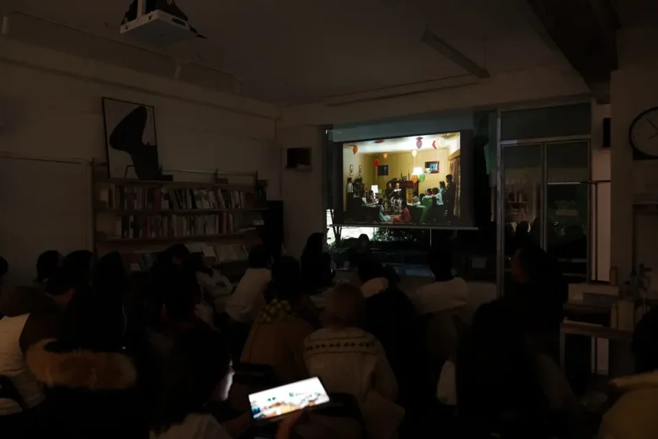
This is just a simple interpretation I'm walking you through; there's much more to explore if you go deeper into this photograph. But it isn't today's main subject. It's just a lead-in, to give you a feel for his staging and the distinctive viewing experience of the lightbox transparencies. The iPad's display is clearly much better and closer to seeing the originals in person, so feel free to pass the tablet around and look closely at the texture of this photograph.
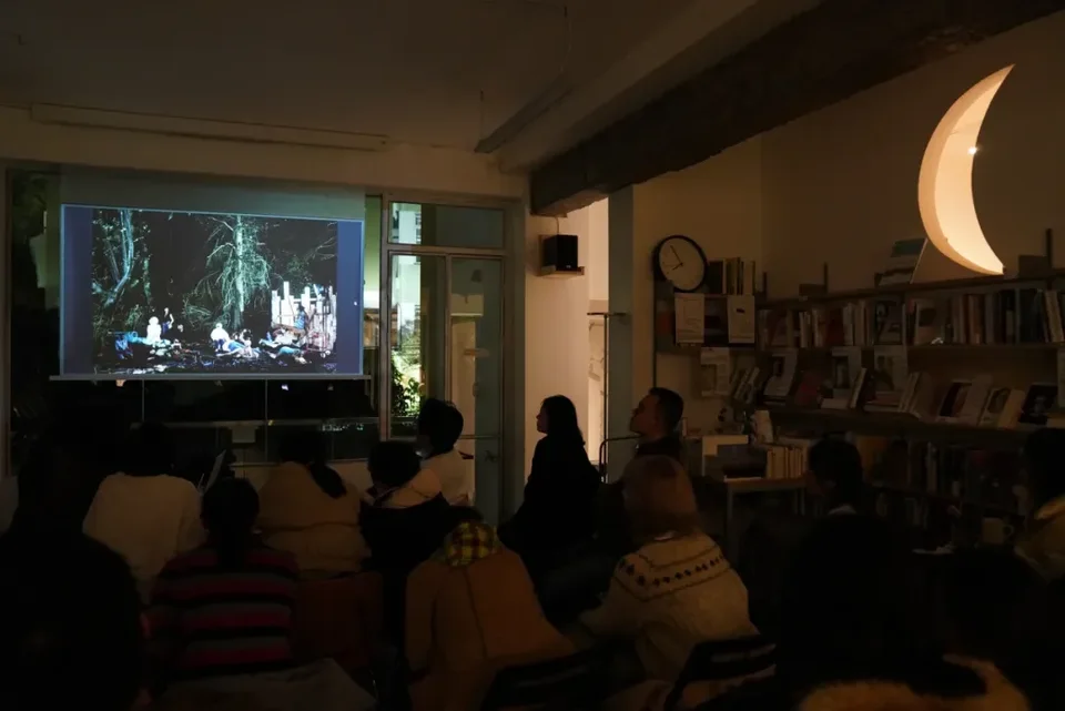
When I announced this talk I thought I could cover five pictures; later I thought three would be enough; and now I realize that, given the time, we'll probably only have time to go into one in depth. One of the pictures I prepared is The Vampires' Picnic, and the other is A Ventriloquist at a Birthday Party in October 1947. If time allows, I'll touch briefly on both, but our focus will be The Vampires' Picnic.
III. The Vampires' Picnic
I mentioned at the start that throughout Jeff Wall's career, almost every photograph is absolutely self-contained. But the three works he made between 1990 and 1992 are an obvious exception. Which three?
One is Dead Troops Talk, another is the one I just mentioned, A Ventriloquist at a Birthday Party in October 1947, and the third is the one we're about to look at, The Vampires' Picnic.
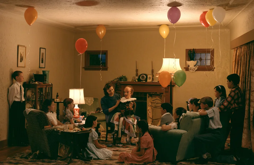
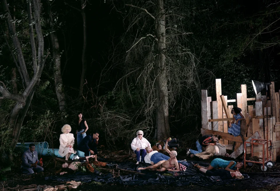
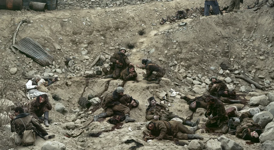
These three works are special because the period from 1990 to 1992 happened to be the critical turning point when the photographic medium as a whole was shifting from the analog era to the digital era, that is, to an era in which photographs could easily be manipulated on a massive scale. More importantly, a single unifying theme runs through all three photographs, and that kind of clear seriality is hard to find elsewhere in Jeff Wall's work.
So if we were to do a complete presentation, we really ought to discuss these three together. They share a theme that runs through all of them, and I think you can see what they have in common in terms of subject. It may not be obvious in this one, but I'm telling you plainly that it shares the same thematic core as the other two. We're not talking about formal matters here, but about subject matter.
Look at the title of this one: Dead Troops Talk. Its subtitle is very long, and I can never quite remember it: "a vision after an ambush of a Red Army patrol, near Moqor, Afghanistan, winter 1986." For "幻象" he uses the word "vision." Looking across all three, Dead Troops Talk, A Ventriloquist at a Birthday Party, and The Vampires' Picnic, you'll notice that each has a very clear inversion between the conditions of the dead and the living.
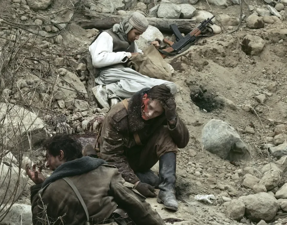
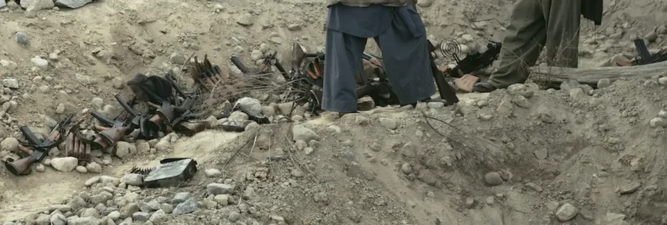
The most typical is Dead Troops Talk. How could dead soldiers talk? But if you look closely at this photograph, you'll find two worlds. One is the world of these soldiers laughing and horsing around, even though they're all dead. The other is the world of the living: over here an Afghan is stealing the soldiers' belongings, and in the upper right two legs are sticking into the frame, possibly belonging to Afghan fighters, with the Red Army spoils they've seized laid out beside them. You could say this photograph is the one where the theme of exchange and inversion between life and death is expressed most bluntly. The vampire picture works the same way: if we take vampires by default to be the "undead," and see the food on the table as "dead things," we can see the correspondence. Personally I think the most fun, and the eeriest, is the ventriloquist picture, but let's do the vampires first.
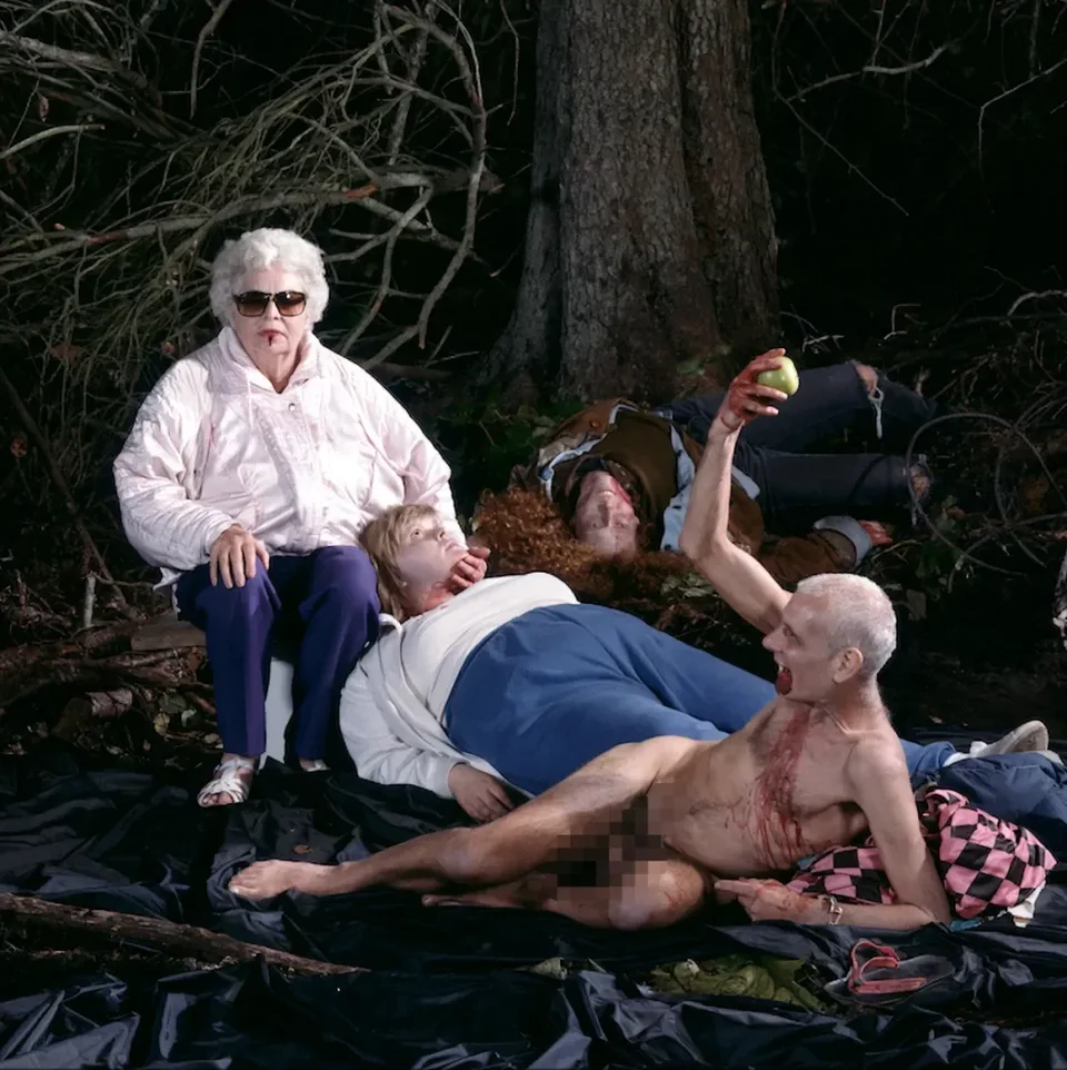
Let's look at The Vampires' Picnic. As before, first take in the whole picture, then find everything you think is off. There's a huge amount that's off in this photograph.
Audience member
The lighting is obviously artificial.
Guosen Chen
That's a very important point. Would anyone else like to add something? Let's look at this one on the iPad; it'll be much clearer. This also explains why you really have to see the lightbox transparencies: with the lightbox, everyone's first reaction when looking at this photograph is to notice the lighting. But in a print or a projection, the effect isn't as obvious. In an actual lightbox display, the lighting contrast in this photograph is extreme.
Audience member
My sense is that with the lightbox effect, there are three especially bright spots in the picture: the blond person on the left, the old woman in the middle, and the lamp at upper right. These three points are unusually bright, which reminds me of what you said about the first photograph: the two lamps reflected in the glass, plus one real lamp. I don't know what the exact connection is, but I can feel that he's using light very deliberately.
Guosen Chen
Excellent. From here, I suggest we read the work in this order: first, examine each figure in turn; second, analyze the relationships between them; third, look at their environment; and finally, bring these threads together and see what overall interpretation emerges.
3.1 Reading the Figures
First, we can see that the center of the whole picture is undoubtedly this area where the light is concentrated, right? So we can start with the figures here and see what's significant about them. I've made some enlarged crops for this purpose.
3.1.1 The Inverted Adam and the Magician
Let's start with the man on the left. Did you notice that he's completely naked? In fact, he's the only nude figure in the photograph; everyone else is clothed.
Looking further down, we can see he's holding something: an apple, and notably, a green one. When you put nudity and an apple together, what comes to mind? Naturally, we think of the story of Adam and Eve.
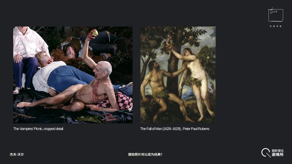
But here's what's interesting. First, traditionally that apple is red. Look at Rubens's The Fall of Man on the right: it's a reddish, ripe fruit, the one the serpent uses to tempt Adam. But Jeff Wall makes the apple green, and green always suggests something not yet ripe, or implies room still left to grow.
Second, we all know that after eating the forbidden fruit, Adam, feeling shame, wants to cover his private parts. But this man doesn't, and from his posture we can see that he's actually quite happily, flamboyantly showing off the apple in his hand, right? So in a sense, you'll notice that in iconography (the study of how a particular visual motif is transmitted and transformed through art history), the apple usually signifies temptation, which may be sexual or of any other kind. Here we can see that Jeff Wall inverts the myth of Adam, completely reversing its meaning: Adam, a naked man, feels shame and wants to cover his body; this naked man brazenly exposes his body and flaunts the temptation he has obtained.
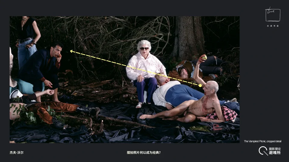
Next, let's look at his eyes. Where is he looking? His gaze is directed at the man in the suit in the upper left. Let's set that man aside for now, since we'll get to him later. Although he's looking that way, what matters is that the man in the suit isn't looking back at him, right? The suited man's gaze seems to be directed at the old woman in the middle or somewhere else; he's too far away for us to be sure.
But I think I haven't yet mentioned the most important thing about this figure. Has anyone noticed something else that's especially strange?
Audience member
Why is there something propped under him?
Guosen Chen
I don't know the answer to that one either. I don't think every detail in Jeff Wall's work can be perfectly explained, and that's exactly what makes it fun. We can only explain what we're able to explain.
Audience member
There's blood on his mouth, but he doesn't look like the other vampires. Isn't he a vampire?
Guosen Chen
Personally I think he's one of the vampires too, so blood around his mouth seems perfectly normal.
Audience member
The shape of the blood around his mouth looks a bit like a bikini.
Guosen Chen
That's a fun observation. It means it's hard to tell exactly what state his feeding is in. But I don't think that's the most important thing yet.
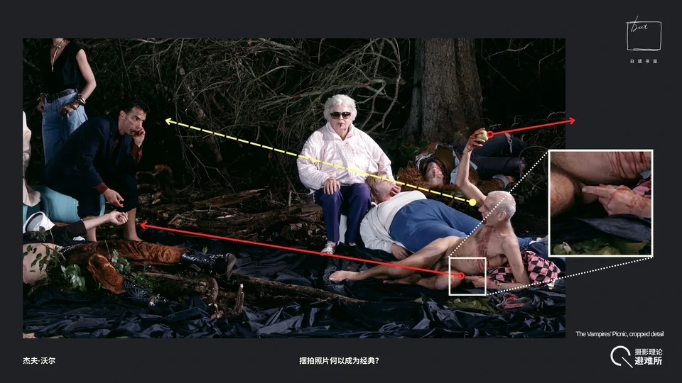
I think we should focus on his pose. First, even standing or sitting, we can try imitating it. Stretch your hand backward like his right hand and see how it feels. If you're holding an apple and have to point it backward at that angle, what a strenuous pose that is. That's the first point.
Second, look at his left hand. Would a normal person deliberately hold their fingers so perfectly straight? This hand is clearly pointing at something, very precisely aiming at a target. Meanwhile, his right hand, in an extremely peculiar pose, points above his body. Try it now. Just holding this pose while standing is exhausting, and since this photograph was staged, we can't imagine how many times the performer repeated the action to achieve the final result. There must be a special intention behind it.
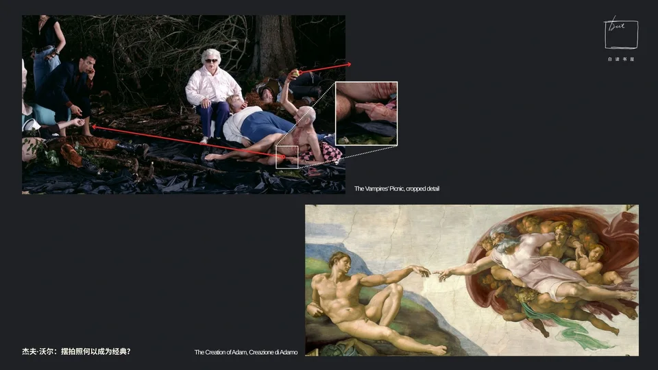
Let's first see where his left hand is pointing. Extend the line and he's pointing at this spot, where a long-haired young rocker is lying. We'll come to him shortly. But this extended finger seems to evoke Michelangelo's fresco The Creation of Adam, the classic moment when God extends his finger to touch Adam and give him life. Combine this with what we just said, that because of the apple and the flaunting posture he is already an "inverted" Adam, and the connection gets even more interesting.
In a sense, a vampire is no longer human but a being that has died and come back. My reading of this pose is that he seems to be imitating God, trying to transmit some kind of vampiric temptation, power, or something else. But the transmission must fail: the distance between them is so great that he can't reach him, and the man lying on the left is thoroughly dead and cannot possibly respond to this naked man in any way. So an image of "life" is completely turned into an image of "death." In a sense, this is also a parody of Michelangelo's fresco: an Adam who should feel ashamed has become an Adam proudly flaunting the temptation he has obtained; the origin of life has become the vampire who drains life; and the hand of God that created Adam can no longer actually touch its object. Because he himself has become an inverted Adam yet stretches out his finger like God, he plays both roles, God and Adam, but both in inverted form.
But that's not all. We still don't know why exactly the artist had him make this gesture. It's clearly not a throwing motion. You can't throw an apple from that position; it would only hit you from behind. And he's gripping the apple so tightly that there's no sign he intends to throw it.
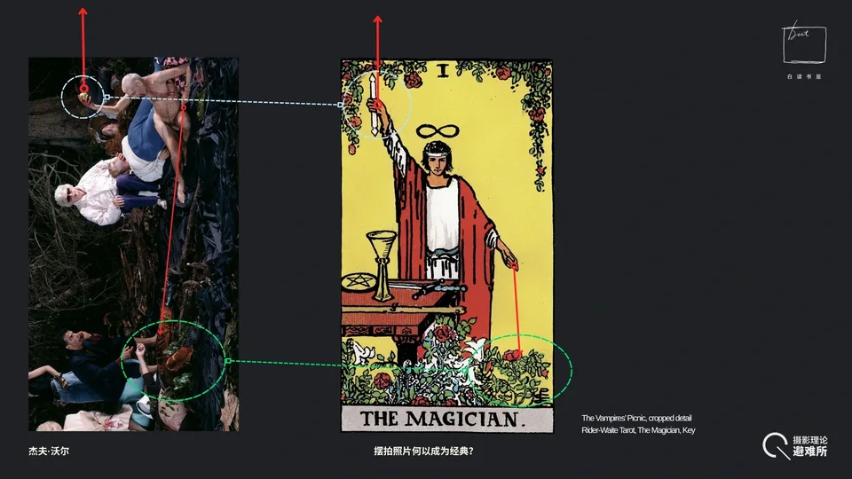
Then an idea suddenly occurred to me. Look at this pose again: if you rotate it 90 degrees, you'll find that his gesture is a clear occult sign, "As above, so below." Its classic embodiment is the Magician card in the Waite Tarot (The Magician, Key I). The Magician, too, has one hand raised holding a wand and the other pointing downward. But as I keep emphasizing, Jeff Wall is playing a game of inversion and irony throughout this photograph. He has rotated this occult gesture, represented by the Magician, by 90 degrees.
In the tarot, the Magician's upright stance means he connects heaven and earth; he's a vertical axis between them. But Jeff Wall lays this figure down, turning him into someone who seems to be rolling around in the mud.
The second difference lies in their props. The Magician holds a wand, a tool for receiving cosmic energy, and points to the flowers on the ground, meaning he channels that energy back into the earth. Here, too, there's a clear process of transmitting and transforming energy, like God creating Adam. But as I just said, this naked man's transformation of energy must fail. The wand is a symbol of will and power, while the apple is a symbol of desire. More interestingly, green plants also appear in the picture. In the tarot, green plants symbolize flourishing life, the realization of potential, and so on. But in this photograph (it may be more obvious if we turn the image sideways), you can tell at a glance that these branches were jammed in just to make them look as if they're growing from the ground, and this is the only spot on the ground with such conspicuous foliage.
So I think this is clearly a complete inversion of the imagery of the Magician card. And tarot imagery appears more than once; there's another figure later who corresponds to it, and we'll come to that other card in a moment.
Next let's look at the central figure in the picture, an old woman. Because of time, I won't take you through her step by step; I'll just tell you what I've observed.
3.1.2 The Old Woman at the Center
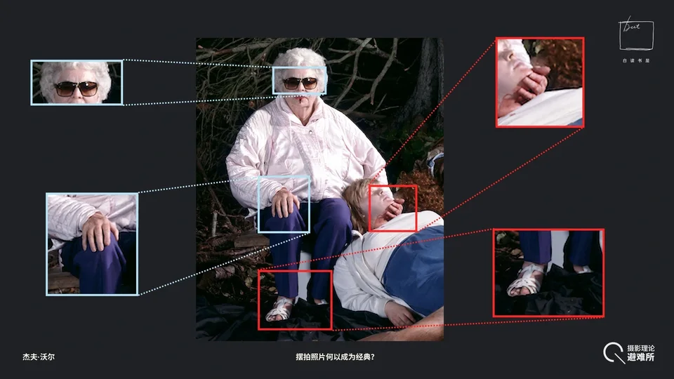
First, her clothing. She looks like an ordinary retired old lady, wearing a white jacket and a pair of sunglasses. Then look at her gesture at the upper right: she's cradling her "food." Notice her hand. There's a certain distance between her hand and the chin; the gesture is more like lifting or caressing, right? But what she's cradling is her food. It's an intensely maternal gesture. Jeff Wall, however, inverts the maternal act of "giving nourishment" into "draining energy." And she presents as a grandmother, a matriarch, placed at the very center of the picture. An elderly, grandmotherly woman making this gesture toward a corpse.
Look at more details of her clothing. At lower left, she's wearing sandals, which makes you feel she has stepped seamlessly from some everyday domestic setting into this very eerie forest. And this white jacket, with its elasticated cuffs and zipper, is a very typical casual outfit of working-class retirees in Europe and North America. So it's hard to explain how such a traditionally ordinary, neighborly elder fits into this scene.
Her pose is also strange: her legs are nearly pressed together, and her left hand rests neatly on her knee. The last time I sat like that was in kindergarten, when the teacher told us to "sit properly." That's about the pose. This is clearly a deliberately designed gesture too, one sometimes associated with religious rituals like baptism. But the key thing is her sunglasses. These sunglasses are great fun. She's not the only one in the photograph wearing glasses (someone else wears them too, as we'll see), but she's the only one wearing sunglasses.
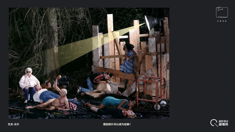
This raises a question: are vampires afraid of strong light or not? There's a very important practical reason she has to wear sunglasses. We know she's a performer, and we can clearly see the powerful light in the upper right. Without sunglasses, she couldn't possibly complete this performance. Where she sits, she's directly in the beam of an extremely powerful studio light; without sunglasses she couldn't even keep her eyes open. And she's the only one sitting in the direct glare.
So I think the sunglasses act as a trigger. They prompt a question in your mind; they're a riddle in themselves, leaving you to think it through. It's rather fun to see it as a kind of ghost story. Vampires are usually afraid of ultraviolet light, and a very bright studio lamp like this may not do them direct harm, but it would at least make them uncomfortable.
In other words, the lamp and the sunglasses serve a double function, on the practical level of the shoot and on the thematic level of the work. Thematically, you can ponder the relationship between light and vampires; practically, without the sunglasses the performer couldn't complete her task.
That's my analysis of the old woman.
3.1.3 The Black Woman vs. the White Woman
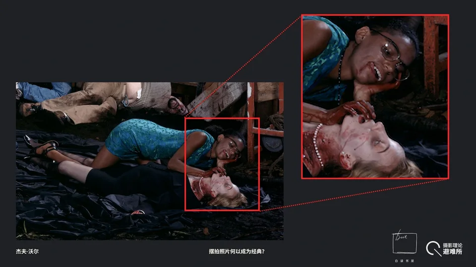
Moving down, there's the woman in the lower right. I find her fascinating. Does anyone have thoughts about her? This is one of the details I find most fun in the whole picture.
Audience member
The woman below is wearing a white pearl necklace.
Guosen Chen
Yes.
Audience member
The white woman seems to be pregnant.
Guosen Chen
Is she? I hadn't noticed that. First of all, she and the old woman are the only two people in the photograph wearing glasses. We've already analyzed the function of the old woman's sunglasses, but glasses like these, rather like gold-rimmed spectacles, usually convey an intellectual cleverness. And interestingly, look at her expression. As she gazes down at her prey, her expression is close to ecstasy, a teasing look full of lust and sexual desire; you can even feel that she's regarding her prey quite tenderly. Moreover, she's Black, and the victim beneath her is white.
As someone just mentioned, the white woman lying on the ground is wearing a pearl necklace, traditionally a symbol of the upper class, a very "grand lady" accessory. And she's wearing a skirt suit, perhaps the most formally dressed person in the whole picture. The right side of her neck has been torn open, exposing some muscle tissue.
Overall, I think the relationship between these two figures first expresses a subversion of racial relations. In the traditional narrative, the one usually cast as the superior, the colonizer who drains others' energy, is white. Now a white woman is having her blood drained by a Black woman. It's a clear reversal of the relationship.
Second, there's same-sex eroticism, which is also very obvious. It's evident not only in the position of her mouth but also in where she places her hand on the other woman's body, a highly erotically suggestive gesture. If she just wanted to drink blood, there'd be no need to put her hand there.
And what's even cleverer here is that the artist doesn't portray this Black woman as a savage. In a work like this, casting a Black character as someone frenziedly devouring white people would certainly draw criticism. So overall, this Black woman comes across as a well-educated member of the elite. She is savoring and preying on her prey, and there may even be a more complicated relationship between the two, while her object is a white woman near the top of the power pyramid.
Speaking of Black figures, let's go back to the whole photograph. Besides her, there are two other Black figures: the woman sitting up high on the far right, and the security guard on the far left. The guard was the figure I found hardest to understand the first time I saw this photograph.
3.1.4 The Black Policeman
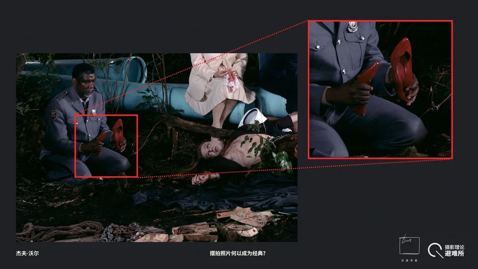
This Black security guard is holding a pair of red high heels. But looking around at everyone present, no one seems to need these shoes. The only possible candidate is the woman in the upper right, but I'll explain in a moment why it isn't her. Nobody else looks like they'd go with these shoes. Whose shoes are they?
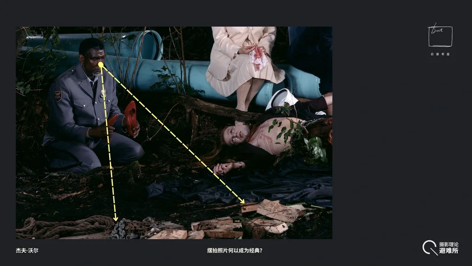
Now look at his gaze. He's looking down. At what? Two things: a chain and a wooden stake. When we see chains and stakes in the context of vampires, we immediately know these are the vampires' bane (there are other things too, like garlic, but none appears in the photograph). Look at his eyes: it's a very melancholy look, completely different from the feeling the Black woman gives. His gaze and posture both sink downward, but this sinking seems accompanied by a kind of bewilderment. He seems not to know what he's doing; he's just staring blankly at these two objects, inexplicably holding a pair of high heels.
And strangely, he's wearing a uniform that ought to signify maintaining order and hunting down unnatural things, something like a police officer's or a guard's, yet he's kneeling. In other words, not only has he failed to do his duty, he may have suffered some setback we can't know about and is displaying a kind of submission.
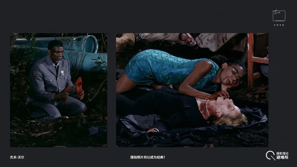
There's another contrast. The Black woman on the right we just looked at is in a highly active state: she is caressing, scrutinizing, and taking the object of her desire. But the Black man on the left is entirely submissive, passive, dazed, and bewildered. Most importantly, we should realize that these two Black figures are positioned at the far left and far right of the picture. The contrast is very pointed.
Audience member
And there's no blood on him.
Guosen Chen
Right, there's no blood on him, which makes this figure even stranger.
Audience member
Could he be the one who brought these people here?
Guosen Chen
Interesting, but I don't think so; otherwise his current state can't be explained. But really, with photographs like this, what matters isn't giving a definitive explanation but discovering that there are riddles and enjoying the process of trying to solve them. There can't be a single solution to a photograph like this. The real puzzle-solving is the question itself. That's exactly what makes Jeff Wall's photographs so much fun.
In any case, these two Black figures, on the far left and far right, form a sharp contrast: one is highly active, the other passive, having suffered some setback.
3.1.5 The Long-Haired Rocker
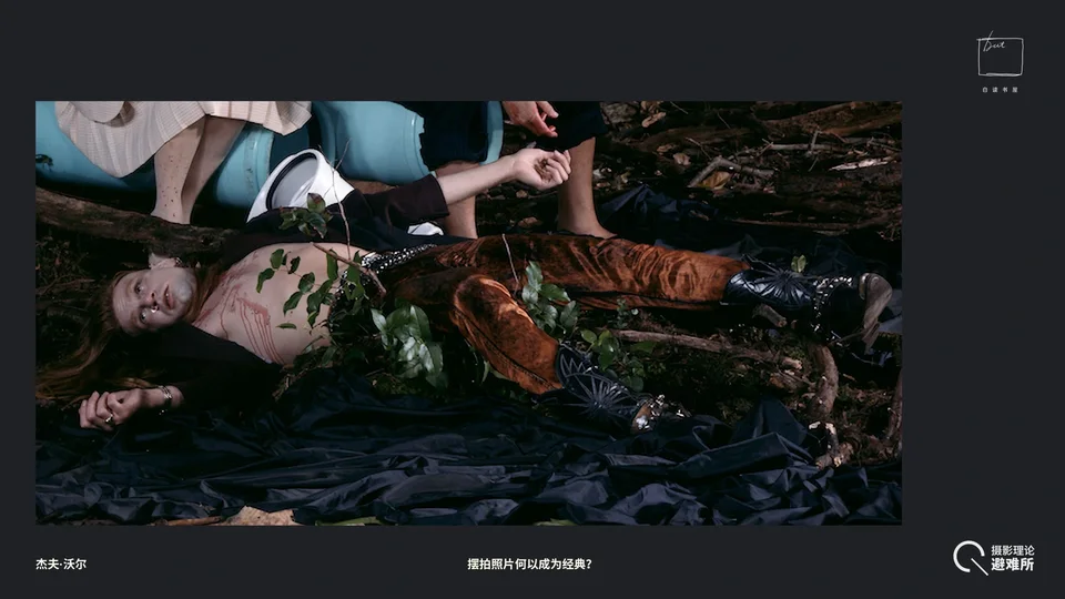
Now let's look at this long-haired man. Some fake branches are wrapped around him. A figure wreathed in branches has a common iconographic counterpart: Dionysus, the god of wine, who in paintings usually wears a crown of ivy. I'm not entirely sure about his case. It may be meant to echo the spot the inverted "Magician's" finger points to. In any case, this combination of figure and foliage does evoke something like a nature deity, though I think connecting it to Dionysus is a bit of a stretch.
Look at his clothes: velvet trousers. The photograph was taken in 1991, and velvet trousers plus those showy studded rock boots on his feet together look very much like the stage outfit of a rock star. So you could say the cultural sign he carries in this picture is something like an idol of the 1970s heyday of rock. His posture is also the most relaxed of all, with longish hair and flamboyant clothes, quite in line with the popular image of the vampire, like the ones in Twilight, right?
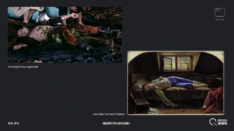
In fact, I think this pose also has a very clear iconographic source: Henry Wallis's painting The Death of Chatterton, one of the most famous Pre-Raphaelite works. The theme of The Death of Chatterton is really about the romantic genius misunderstood by the world, and the aestheticization of death itself. If you're interested, look up the painting on the right yourselves; time is limited, so I can't go into it in detail. It depicts the death of Chatterton, a gifted 18th-century English poet.
Chatterton and this rocker are very similar in pose and atmosphere, because both are connected with the arts, and people drawn to the arts often tend to romanticize and aestheticize death, violence, sex, and the like. I think Jeff Wall is satirizing this pursuit of decadent beauty. And as we said, this figure is lying exactly where the "Magician"-Adam's finger is pointing, which suggests he may be trying to use some energy or magic to revive this already-dead "genius," but ultimately fails.
3.1.6 The Black Woman Watching from Above
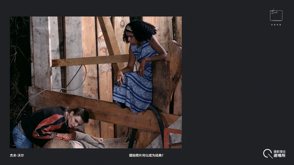
Now the last Black figure in the picture, the woman in the blue dress in the upper right. She's the only one not taking part in this vampire game, or this scene. You can't tell she's a vampire; she seems more like someone detached from this world. And she's sitting right on the lumber used for the set, the kind of industrial timber beams. Behind her are the beams and the forest beyond. In a sense, she's the one furthest from this fictional scene, but what she's closest to is Jeff Wall's own production process and act of creation. This is very much like what Brecht called the "alienation effect," reminding you very pointedly that this is only a set.
She takes no part in anything happening below, keeping a firm distance from the ground. We can also sense that her expression is odd, somewhat hesitant and somewhat weary. Why weary? Because a vampire's life is endless, and in the endless river of time the emotion most easily felt may be boredom. She just quietly watches these vampires busying themselves below.
3.1.7 Youth vs. Middle Age
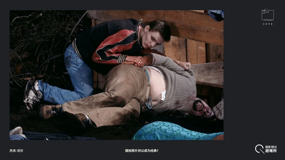
So what is she looking at? Her gaze falls on these two figures to her lower left. They're interesting too: a young man lying on top of a middle-aged man. First, the young man's clothes: a baseball jacket and jeans, very much like the campus-boy look in American TV shows. The combination of baseball jacket, jeans, and sneakers in particular is often associated with the image of the American high school bully, a very typical "teenager" outfit. Then look at the man lying beneath him, clearly much older. A youth confronting a middle-aged man who looks about his father's age. The middle-aged man is wearing dirty khakis and a beige sweater.
And this pair is completely different from the predator-and-prey dynamic of the Black and white women below them. The pair in the lower right corner is a seductive relationship, but what is this one? An oppressive relationship.
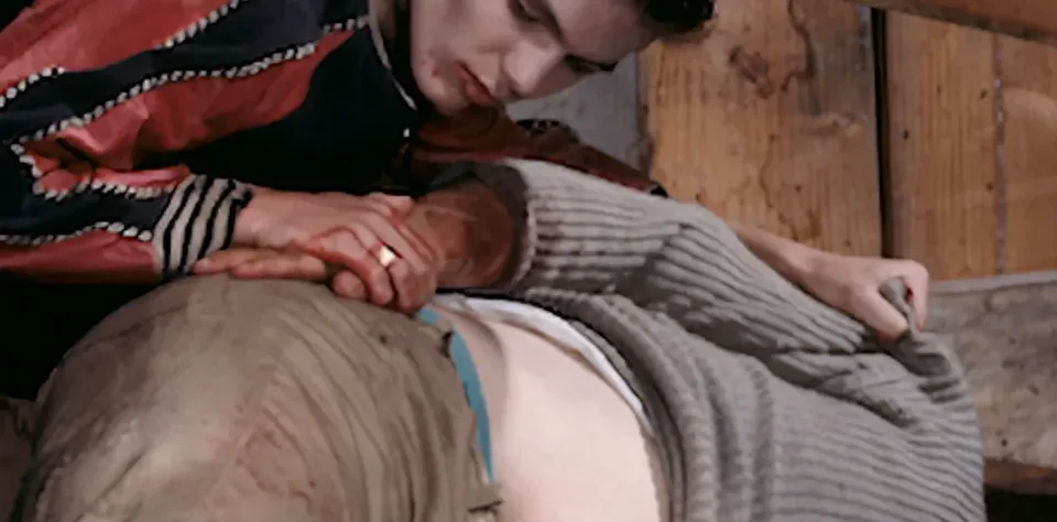
Notice his hands: his right hand presses down directly on the man's arm, and his other hand is on his shoulder, as if pinning someone down, twisting their arm behind their back. So you could say there's a sense of intergenerational conflict here, mixed with a depiction of the relationship between a slack, aging middle-aged man and a campus youth who uses his youth and strength to bully others.
What's even more interesting, or even less explicable, is that the middle-aged man's paunch has been deliberately exposed, and there's something white tucked into it.
Audience member
The corner of his shirt.
Guosen Chen
Right, the corner of his undershirt. His shoes are sporty hiking shoes, and his trousers are dirty too.
3.1.8 "The Hanged Man"
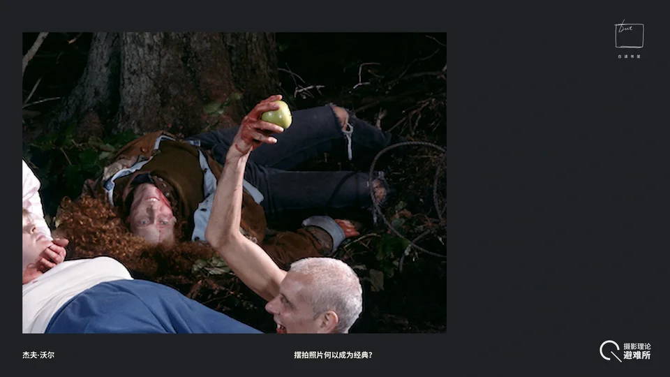
Now this figure. He's even stranger. I think he has something to do with the tarot again, because he's the only one whose face is completely upside down, and his whole upper body seems to be hanging down. More importantly, look at his eyes. Whom is he looking at? He's looking at the man holding the apple, the "Magician," the inverted Adam we began with.
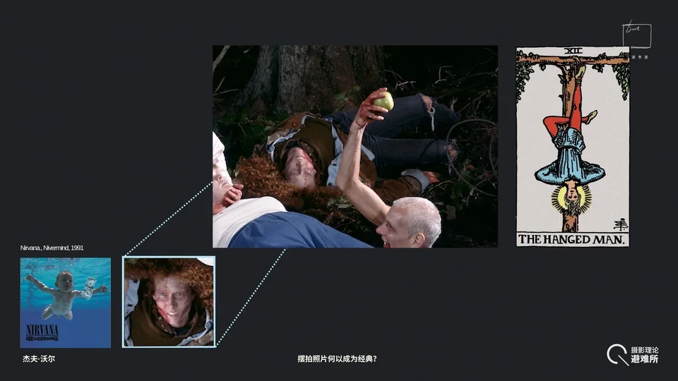
So first, I think the iconographic source may be the Hanged Man card. The Hanged Man hangs from a tree, and his symbolism is sometimes about gaining, through sacrifice, insight into things one can't perceive when upright, that is, seeing the world from a different angle. But while the Hanged Man may bring enlightenment, this man's expression looks completely different right side up versus upside down. Seen as the photograph presents him, he seems somewhat "blissed out" or high, but his expression is the most inexplicable of anyone in the photograph, and the least likely to be seen in real life.
Behind him, to the right of his feet, is barbed wire; he's lying in a tangle of wire and dead branches. More importantly, I mentioned that if the long-haired rocker in the lower left refers to a 1970s rock style, then look at this man's ripped jeans. That look was just emerging around the time Jeff Wall took this photograph (1991). In 1991 Nirvana released their most famous album, Nevermind, which basically swept through youth culture across Europe and North America. His hair is strange too: there's an abnormal amount of it. That afro is huge to a bizarre degree; it's hard to imagine a person having such a mass of hair, it almost covers his shoulders. This, too, is very odd.
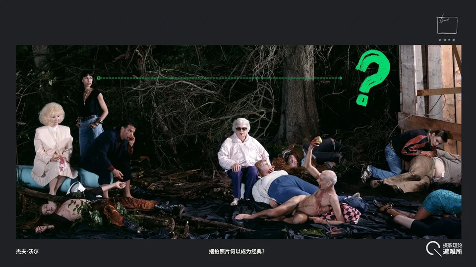
3.1.9 The Hands-in-Pockets Woman
Now we've basically only got the few figures on the left left. First, the only person standing. What is she looking at? The direction doesn't seem to be the Black woman, because her eyes are turned almost to the corners, which means she shouldn't be looking at the seated figure. So what is she looking at? Follow her line of sight and there's nothing, just darkness.
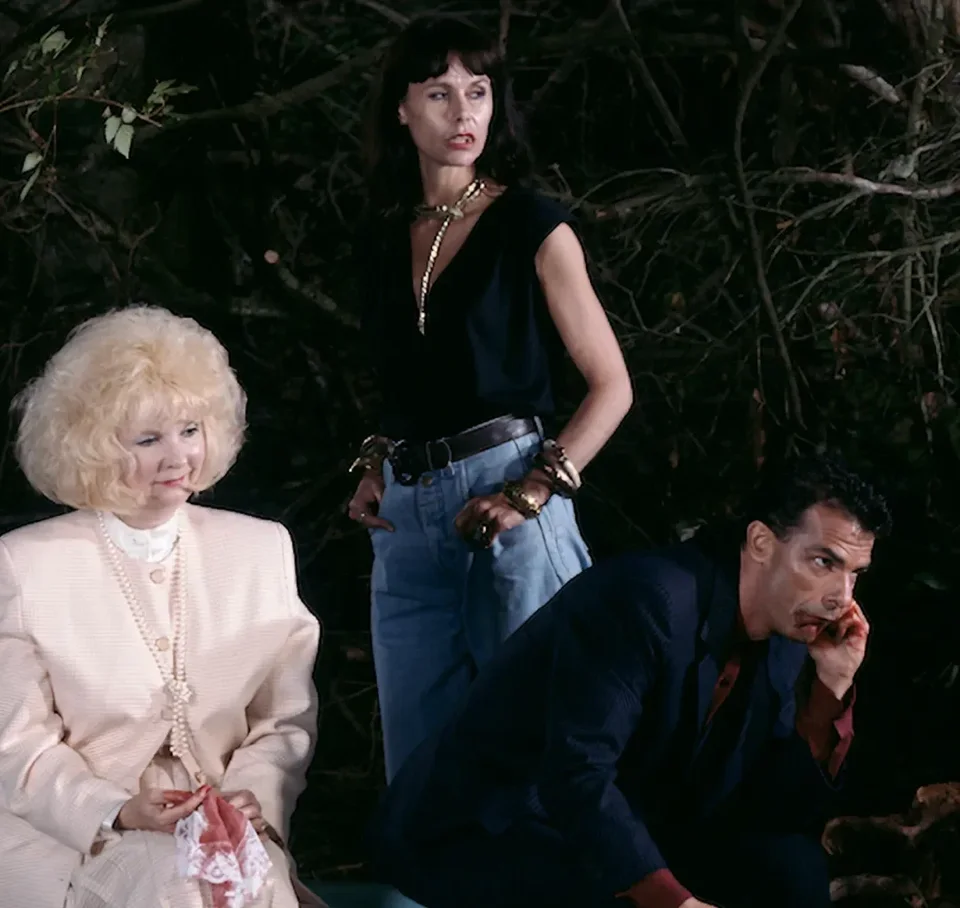
Look at her pose: hands in pockets, specifically that pose where only the thumb is tucked into the jeans pocket and the other fingers are left outside. She also wears more metal hardware than anyone else in the picture: a chain around her neck, and her hands covered in metal jewelry. Her expression is a kind of sidelong glance. Look at her mouth: above her lips, her upper teeth are showing, while her eyes glance to the right. Think about it: when you smell something foul or really unpleasant, isn't that disgusted expression a bit like this? Overall, what does she resemble? The lookout of the vampire clan. She's in a state of alertness and vigilance. Her stance is very masculine, even a bit like a small-time punk, not quite respectable. Her clothes are also very androgynous: practical jeans and a tank top. So she seems like someone standing guard.
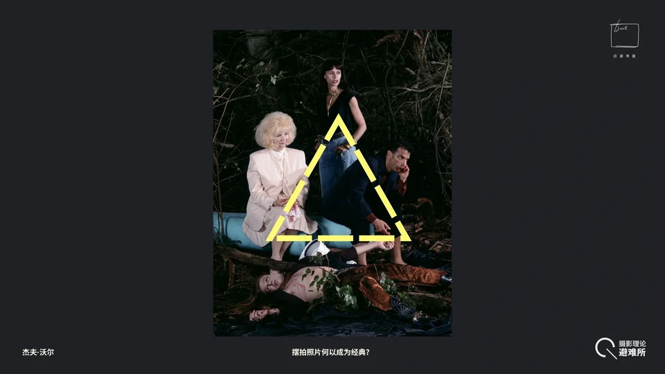
She and the two figures below her form a very stable triangle.
3.1.10 The Thug in the Suit
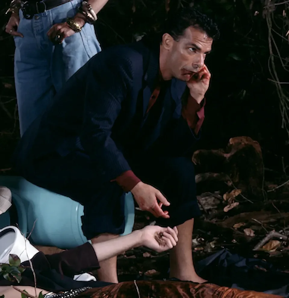
Look at the man in the suit. His navy pinstriped double-breasted suit is very much a '90s look, the kind you'd see in finance films and gangster movies. But strangely, his feet are bare. He isn't wearing shoes; he's standing barefoot on the mud, for no known reason. And of these three figures, he's in the most uncomfortable pose. He's sitting on a pipe, a very unstable position; his whole body is tilted downward and he has to prop himself up with his hand. Propping himself this way, on one hand you could say it resembles a pose of contemplation, but if you look closely, the way he holds his hand to his face might look like he's wiping away blood, or rubbing his face. Combine that with his facial expression: it's a highly alert expression, his eyes wide open. When people are anxious, they sometimes rub their faces unconsciously to soothe themselves. He forms a very clear contrast with the standing woman behind him. She's very composed, even with a sense of being in control of everything, while this man seems very jittery.
3.1.11 The Neoliberal Middle-Class Lady
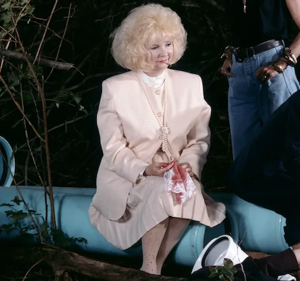
Finally, this woman, this "lady." Her outfit is in the style of 1970s–'80s Britain under Thatcher: this beige checked suit plus a pearl necklace was a fairly typical look of that era. But what's fun is that there's blood on her stockings. Look at her hands: she's clearly wiping away bloodstains with a handkerchief. She's wearing a very neat white garment that's easy to soil, yet she's trying very hard and very calmly to wipe off this filthy blood. No one else in the scene shows this kind of ambivalence toward blood: I clearly need it, but on the surface I have to clean it all away, as if once the bloodstains are wiped clean, I'm still a perfectly respectable middle-aged woman. The interaction between these two is also interesting, and look at what he's sitting on: a PVC drainpipe, a very strange, very industrial object.
Okay, that's roughly all the figures.
3.2 Relationships Between the Figures: A State of Non-Communication
Now let's look back at the relationships between these figures. On a second look, what kind of relationship do all these figures form? It feels like a family, but one full of strange things.
Audience member
Like a team with a very clear division of labor.
Guosen Chen
In terms of composition, of course we can see this group, that group, and then another on the right, roughly three groups. But here's a question: look carefully at the direction of each person's gaze. Can you find any two people who are "looking at each other," where I'm looking at you and you're looking at me at the same time, with gazes meeting?
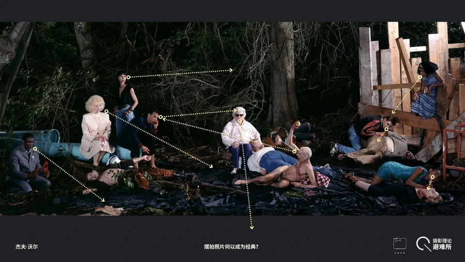
The answer is no. I've extended the lines of sight of those still "alive," those still able to move, so let's look at their gazes.
First, the Black woman on the right looks at her prey; the "Magician" in the middle looks at the man in the suit; but the man in the suit looks at the old woman in the middle, the matriarchal, clan-elder figure; the old woman looks straight at the camera; the standing, sentinel-like woman on the left looks off into the unknown; the lady in Thatcher-era clothes gazes at some empty spot; and the Black guard, as we mentioned, at best is looking at the stake and chain, and at worst isn't looking at anything in particular.
No two gazes here meet; in other words, there's no communication of any kind between them. What to make of this is up to each of you; I won't over-interpret it here. I think you can speculate in all sorts of ways, but the fact is that everyone in the picture is in a state of no real communication.
3.3 The Setting: Enclosure, Manet, and "Flowing" Blood
3.1 The Enclosure of the Scene
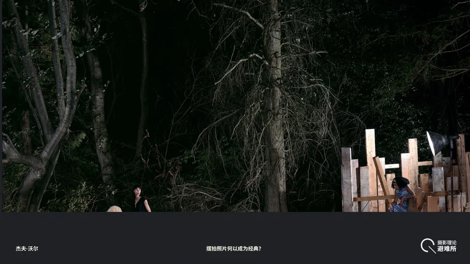
Next, let's look at the environment. Jeff Wall's photographs have a very distinctive feature, not just this one: most of his works give you the sense that what they show is a closed world, but that beyond what the frame lets you see, other things seem to be going on that simply weren't captured. He always manages to create this strong implication. It comes from a method he calls, in his own words, "cinematographic photography."
Think about film. We naturally accept that a film gives us a frame that encloses things. When we look at any single frame, we're always aware that as the camera moves, there may be other characters active outside it who simply aren't in the shot for the moment. We also accept that the world a film presents is always self-contained: closed and internally consistent. Jeff Wall's photographs are similar in some ways, but they're not film stills at all. He tries to build a closed world within a single photograph, while suggesting that beyond the frame there's a world with its own causal continuity, containing more stories and events.
So the enclosure of his scene is obvious. Apart from some trees, the background is pure darkness; you can't see anything in the distance at all. It doesn't feel like an open natural space. And the trees grow very chaotically, so we know this isn't a managed suburb of a city. Where people live, trees usually aren't allowed to grow like this.
3.2 Manet's Le Déjeuner sur l'herbe: "Opening" vs. "Darkness," Nude Woman vs. Nude Man, Still Life vs. Chains, Frontal Light vs. Side Light
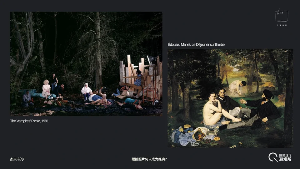
Even more interesting, this is a picnic held at night, whereas people usually picnic during the day. Of course, it's hard to call it pure night here, because the lamp on the right serves as the picnic's light source, playing the role of the sun. In other words, this lamp also has a narrative function.
And when we think of the theme of the "picnic," a famous painting by Manet comes to mind. We mentioned at the start that Jeff Wall studied art history for a few years under T.J. Clark at the Courtauld, and that he went to look at Manet's paintings every week. And Manet's most famous work is Le Déjeuner sur l'herbe. Compare the backgrounds of the two and you'll find both are woods, but what's the difference?
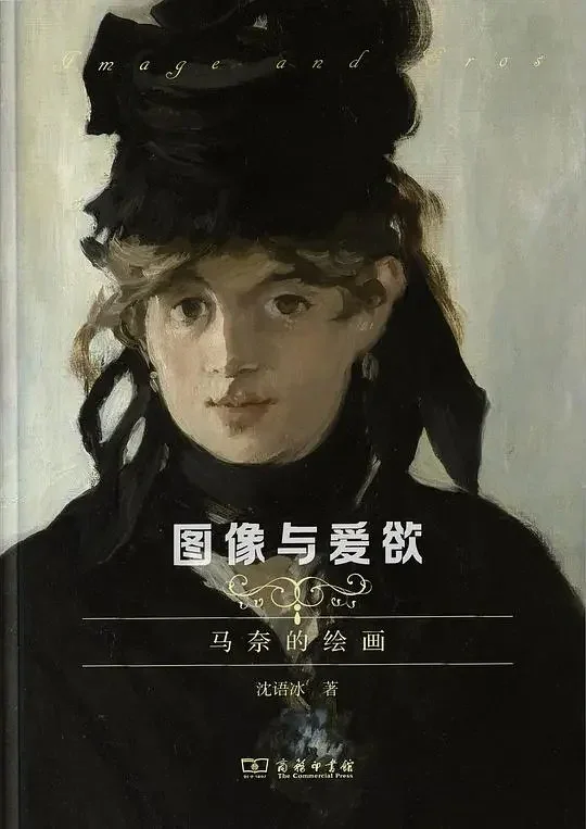
Manet's painting is one of the most analyzed works in modern art history. If you're interested, have a look at Image and Eros by my advisor, Professor Yubing Shen; it has a whole chapter on Manet's Le Déjeuner sur l'herbe. The very first painting I encountered when I started out in modern art was, you could say, Manet's Le Déjeuner sur l'herbe, as explained by Professor Shen.
For example, we notice that Manet's painting also has plenty of things that are off. The perspective of the woman in the middle is wrong: she's clearly larger than she ought to be, which violates the rules of perspective.
Moreover, in Manet's painting, there's a clear light source, or opening where light comes through, in the middle of the woods in the background. You can feel the space extending into depth, with a vanishing point there. Although the perspective has problems, it provides an "exit," and on the whole it's a very open world. In Jeff Wall's photograph, we can still find a hole similar to the one in Manet's painting, but it no longer provides light or an exit. It's now pure, closed, very flat darkness. The "exit" in Manet's painting has been sealed shut.
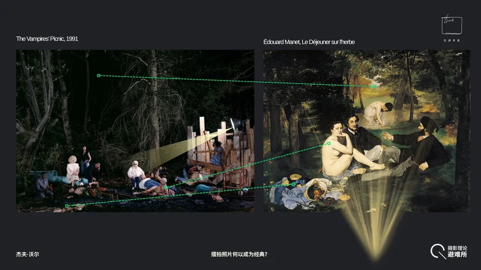
Next, Manet's work also has a nude woman as its focus, seen at the time as a representative of nature. But in Jeff Wall's photograph, the nude is a man, an old, bald, skinny man at that. This is a striking gender inversion.
In Manet's work, the most analyzed detail has always been the still life in the lower left: the basket, figs, cherries, bread, and the dress the nude woman has taken off, all things that let one enjoy worldly pleasures. In the lower left of Wall's photograph, we also find a still life. Did you notice? In fact, along the very bottom edge, only the lower left has anything in it, which shows the artist deliberately made this echo. But the still life in this photograph's lower left is what I mentioned earlier: stakes, iron chains, locks. You could even call it a pile of junk. So the lavish lunch becomes objects that might kill vampires, objects representing control and restraint. This, too, is an inversion.
Finally, there's the question of light. One important reason Manet is called a founding figure of modernist painting is that he began using frontal light in his work. Frontal light means light striking the figures head-on, making their bodies look especially flat, unlike side light, which creates a sense of volume. In many of Manet's works, especially The Fifer and The Balcony, we can see him very consciously using frontal light to dissolve the figures' sense of volume.
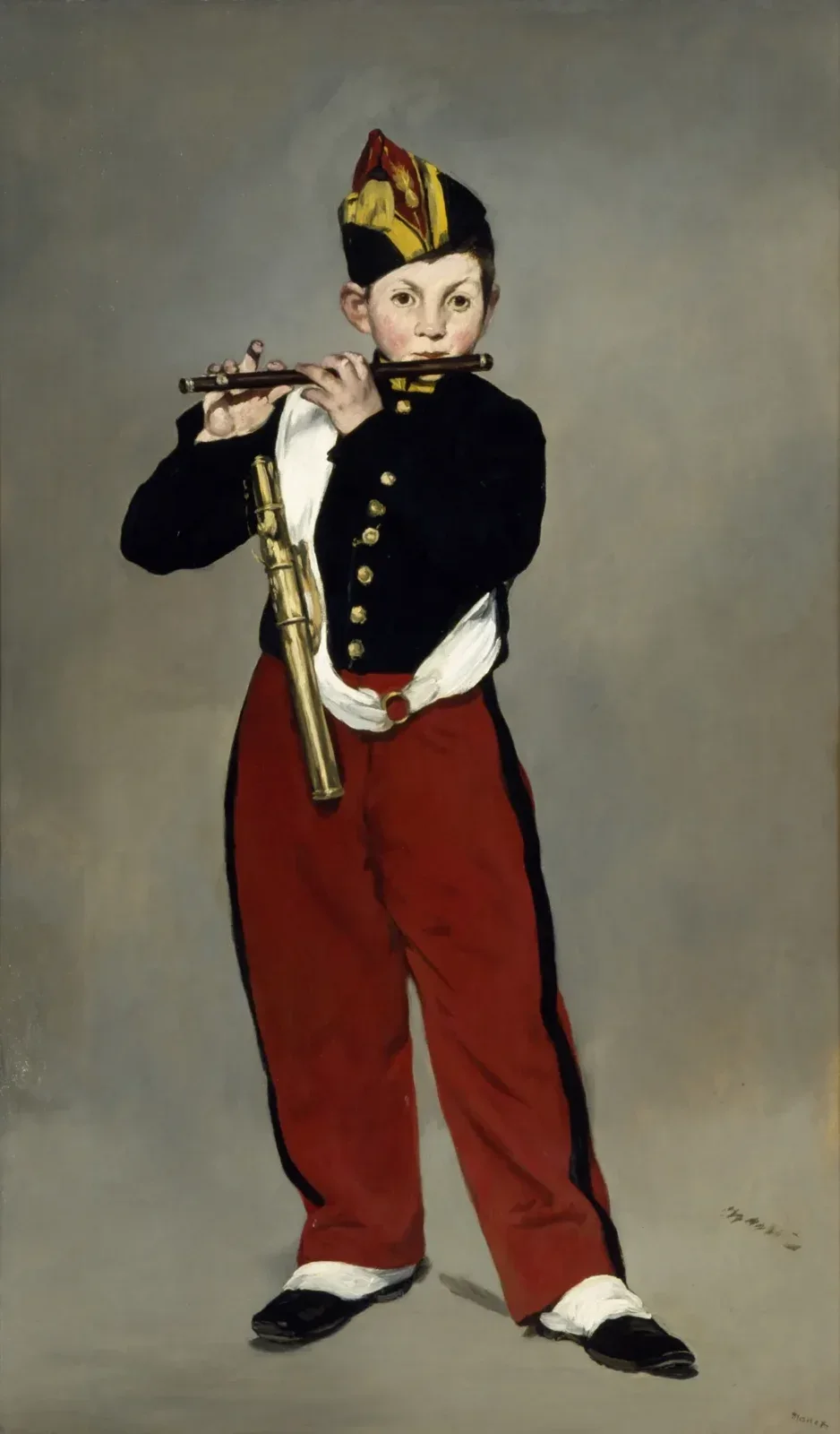
This was later interpreted by Clement Greenberg, the author of Art and Culture, which we brought with us today, as the beginning of painting's movement toward flatness. He argued that modern painting's development up to Mondrian wasn't a matter of becoming ever more abstract, but of painting coming ever closer to the essence of its medium: so-called "medium specificity." For Greenberg, the essence of painting is flatness, because painting has nothing but canvas and paint. So modern painting isn't becoming more and more abstract; it's continually returning to the constitutive essence of its medium, the material of paint and canvas itself. The picture thus becomes flatter and flatter, which also means eliminating the linear perspective that creates the illusion of space. Ultimately, complete "flatness" is the grid, the grid of Mondrian's famous red, yellow, and blue paintings. In her major work The Originality of the Avant-Garde and Other Modernist Myths, Rosalind Krauss's first essay is called "Grids," devoted to analyzing why the grid is such a crucial motif in modernist painting.
In any case, all of this began with Manet's painting. Manet's work tends toward flatness, but Jeff Wall's photograph clearly uses side light. He even places the lamp explicitly on the right side of the picture. It's unmistakably side light.
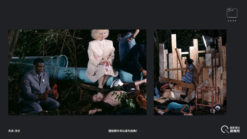
3.3 Industrial Lumber and Pipes
Now look at the industrial lumber on the right; I won't say much about it. What's more interesting is the red cart below it, used for moving generators or equipment, with electrical cables wrapped around it. All this indicates that this is definitely a temporary set that has to be moved and struck. We could even go further and imagine this vampire clan as something like a circus, just passing through this place for the time being. And the cart is red, harmonizing beautifully with the blue and yellow next to it. Just from this little corner on the right, we can sense how harmonious the color scheme is.
On the left is the PVC pipe. It's in a blue we associate with cleanliness and hospital hygiene. In reality we rarely see PVC pipes in this color; the pipes buried in cities don't usually look like that. It was clearly painted this color deliberately, forming a nice, near-complementary contrast with the red.
3.4 The Industrial Plastic Sheeting: Blood and Flow — The Figures' Relationships Revisited
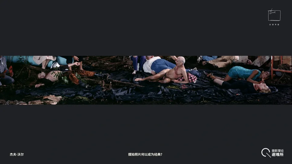
Finally, we come to the last thing about this photograph. The last thing I want to show you is this large black material on the ground. It should be that rough, heavy plastic sheeting. It has some very specific uses in real life: dustproofing and waterproofing, for instance keeping garbage from leaking when it's piled up; you might even see this material at some crime scenes, to keep blood from soaking through. It's essentially the equivalent of the picnic blanket in Manet's painting. But thematically it has a very clear connection to "the vampires' picnic."
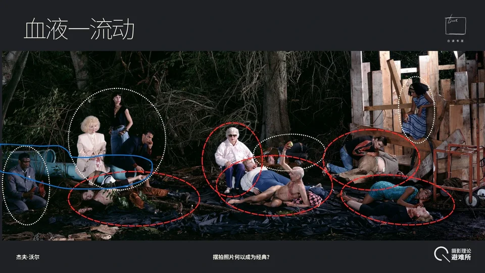
First, let's see who is not on the sheeting. I've circled in red those who are on it or in direct contact with it. Let's see who they are.
First, all the "food" is on the sheeting: the white woman being devoured on the right, the middle-aged man in the upper right, and the long-haired rocker on the left. Then, those eating them are also on it: the Black woman on the right, the campus bully above, and the matriarch in the middle. All those doing the "eating," or showing a feeding relationship, have more or less a hedonistic bent. So you could say the people on the sheeting are in a relatively pure bodily relationship, most obviously the pair in the lower right, and the domination in the upper right is also an extreme bodily relationship. Either they're the thing being eaten, or they're immersed in eating people, or directly involved in the business of "eating people."
Those not on the sheeting are the ones in white circles: the Black woman in the upper right, the Hanged Man in the middle, the trio in the upper left, and the guard. They all keep their distance from pure carnal desire and the theme of "eating and being eaten." Even the lady, though she has just finished eating, insists on keeping her distance from all the feeders, anxious to clean off the filth quickly, all while acting as if nothing happened. You could say there's a barrier between these people and the vampires below, like two kinds of "ghouls" with different values: one watching the others eat people, one wanting to pretend she has nothing to do with them, one disgusted by something, one lost in thought, and a guard sunk in existential doubt. Not to mention the Black woman in blue in the upper right, who is simply watching from the sidelines. They all keep some distance from those on the sheeting.
More importantly, why do I say the sheeting is directly related to the theme? Spread out so long, the sheeting even looks like black oil slicks, or has the sense of flowing black blood running straight through the whole picture. In vampire stories, one of the most important motifs is "flow": the flow of blood, the spread of a virus, the transmission of knowledge and memory through blood, like an infection. A vampire only has to bite someone to instantly absorb all their memories and abilities. So on the whole, the vampire clan is really a vast collective mind, what we might call something like a "hive mind." Once you've been bitten, all vampires share the same blood, connected to one another through it, sharing their thoughts and everything else.
Now think back to the pipe. In this sense, the pipe serves a corresponding function too. In urban infrastructure, pipes handle the exchange of liquids, whether industrial wastewater or your drinking water, but in any case, the exchange of liquids necessary to sustain life. So the pipe and the black sheeting below, flowing like blood, are also clearly connected thematically.
In any case, I think that's about it for this photograph. After this analysis, you should understand why it takes him two years to make a photograph. The workload is definitely no less than that of painting a picture, and I believe he has thought of more than I have, not less. My analysis just now barely touched on deeper meanings. For example, I didn't say that the absence of eye contact among these people might relate to the atomized individual of modern life. Personally I don't much like that kind of reading, but it's hard to say his work doesn't contain such things. I haven't even begun interpreting at that level, and yet we can already see how many details and how many allusions to iconographic tradition it contains.
We're right at about an hour and a half now. Shall we wrap up? We can have an open discussion, or after the event you're welcome to take a closer look at the other photographs I have here.
IV. A Ventriloquist at a Birthday Party in October 1947※
Audience member
Could you talk about the Ventriloquist one?
[※] Some of the observations in the analysis of Ventriloquist were first pointed out by Linzi in our early conversations; my thanks to her.
Guosen Chen
Let's go through it briefly. This is actually the one of his works I've spent the most time looking at. There are a great many strange things in it.
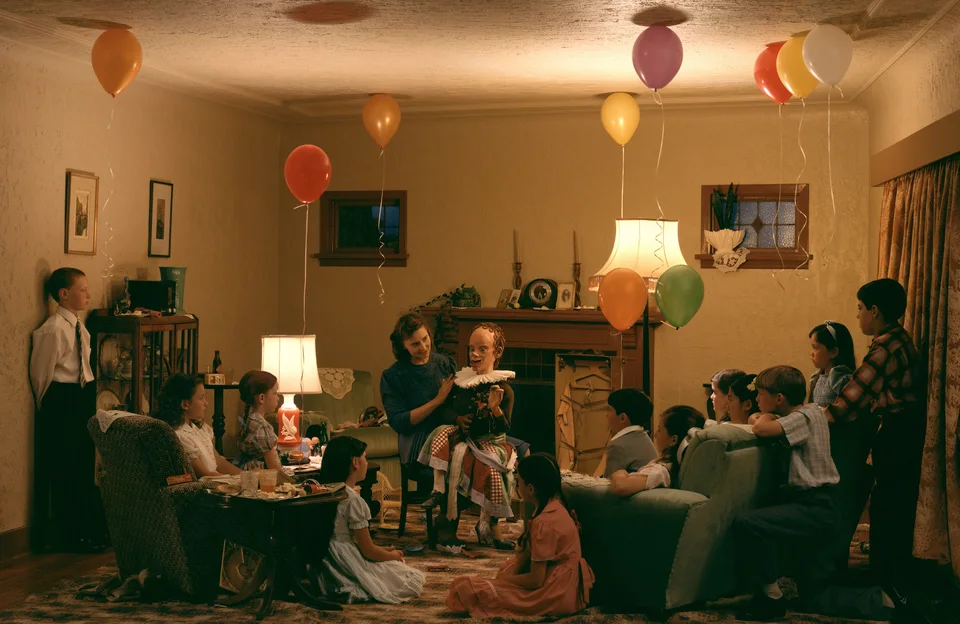
The title is fun: A Ventriloquist at a Birthday Party in October 1947. The title itself tells you a lot: first, the time is 1947; second, the occasion is a birthday party; third, someone is performing.
There are countless things off in this photograph. With The Vampires' Picnic, you can mostly explain its content, but much in this photograph simply can't be explained.
Audience member
Have later scholars studied this?
Guosen Chen
A lot, but there doesn't seem to be any research on it in the Chinese-speaking world; it's all Western scholarship. Can you spot what's off in this photograph? There's an enormous amount, far too many strange things. It's different from The Vampires' Picnic. In The Vampires' Picnic, the figures' gazes are scattered, but in this photograph the gazes are very concentrated. Everyone is looking at the performer in the middle. Does anything feel wrong to you?
4.1 Overview
This photograph has so many details that it's hard to know where to begin. First, the overall scene. You'll notice there are people here and people there, right? They form a V-shaped composition that leaves a gap just right for us, and for the camera, to view the whole scene.
Second, look at the room. Doesn't the perspective feel strange? Especially at the joins between the ceiling and the walls.
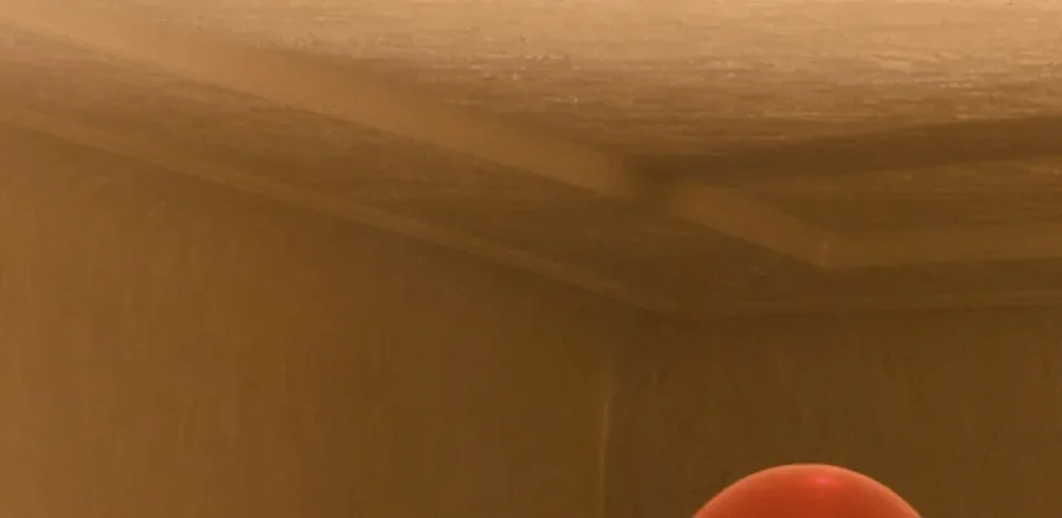
To this day I haven't figured out the room's actual structure. Overall it seems like this: the back wall is slanted, and the joins between the ceiling and the three walls are completely misaligned, each offset at a different point. See? The ceiling's corner is here, but the wall's seam is there. It's offset on the right too, where the wall folds inward. And this spot is curved, a rounded corner. This was clearly designed deliberately. He really did build a studio set specifically to shoot this.
4.2 The Dummy's Incongruities
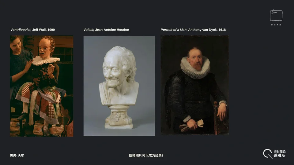
Now the dummy in the middle. Simply put, the dummy's head is based on Houdon's sculpture of Voltaire. Voltaire represents European Enlightenment reason and the wisdom of the Encyclopédistes. But here the great philosopher has been shrunk into a monster with a big head and a small body, as if from overthinking. The ruffled collar around his neck, a ruff, is typical of 17th- and 18th-century dress.
So an Enlightenment-era dummy wears a 17th–18th-century collar. In this 1947 American household, the collar makes him look even more out of place.
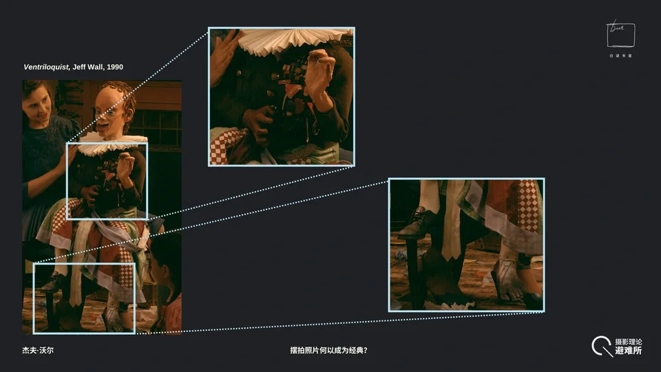
Look at his top: an Eisenhower-style military jacket hung with medals, which had special significance at that particular moment in 1947. It's a symbol of the victors of World War II, standing for masculinity, discipline, and state violence. But below, he wears a plaid skirt, clearly women's clothing. So the dummy's outfit is full of contradictions: the top half conveys sovereignty, maleness, virility, combat, and conquest, while the bottom half is a woman's skirt. From this "male above, female below," "military above, civilian below" combination, you can see the dummy's gender is highly ambiguous.
Looking further, we find his lower garments are dirty. More importantly, one of the dummy's feet wears a leather shoe while the other is bare, smeared with dirt, and its toes are broken off. This is very eerie.
The second eerie thing is the dummy's gestures. The gesture of his right hand is actually a characteristically Voltairean oratorical gesture. Now look at his left hand. What does it feel like? It's entirely a claw, straining hard, a completely inhuman hand gripping his own thigh. A civilized, Enlightenment image and a regressive, bestialized image are superimposed on this dummy at once, just like the patchwork of its clothes.
4.3 Theme I: Anachronism
If the theme of the first photograph we looked at, A View from an Apartment, is "reflection," then I think the main theme of this one is "anachronism." The most direct evidence is what we see on the dummy, as I just said: 20th-century clothes, an 18th-century collar. That in itself is a temporal dislocation. But where's the real evidence?
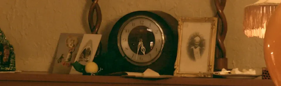

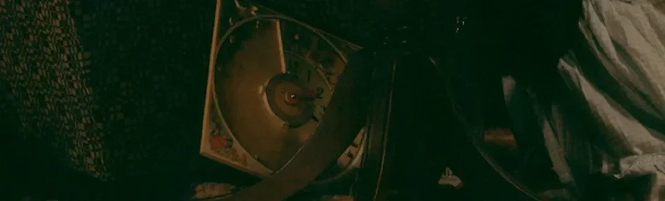
Look carefully. When we think of time, we know that what most indicates time is usually a clock, right? There are three clocks in this photograph. The most obvious is the one above the fireplace, reading about 5:36. The small clock on the mantelpiece has its hour hand around 11 and its minute hand at 30, so 11:30. And the one below may be a board game, but since it has numbers on it, the artist probably still wants us to read it as a clock. Its hour hand points to two and its minute hand is just past three. All three clocks show different times, so what time is it actually? We have no idea at all.
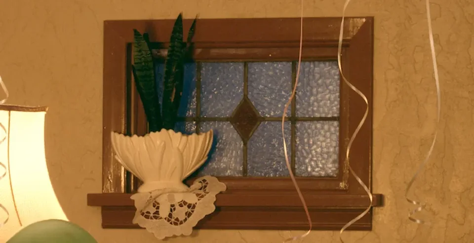
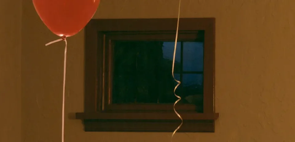
There's also the problem of the windows. The window on the right uses patterned glass. This kind of glass is usually used in bathrooms or entryways for privacy, and very rarely in a living room's main window. And it has an eerie bright blue color. But the window on the left shows that it's night, with only a very faint blue light in the sky. If the left window shows pitch-black night outside, why is the right window as bright as an overcast day? From this we can see that the temporal order in this scene is completely scrambled.
Of the two windows, one is transparent and one is opaque. As for the left window, given how bright the room is, this clear glass should strongly reflect the interior like a mirror (the table lamp, for instance). But all we see are twisted branches and a gloomy night. The right window has an arrangement on it too: loops of a crocheted doily, and plant leaves. Thierry de Duve later argued that the right window is really a still-life painting, refusing the outside world and absorbed in the decoration and display within its own still life.
4.4 Not the Living
So we can draw a conclusion: none of the people in the photograph are human in the biological sense. They're something like ghosts or the undead, and their temporal order differs from that of normal people. Why do I say they're not normal humans in the biological sense?
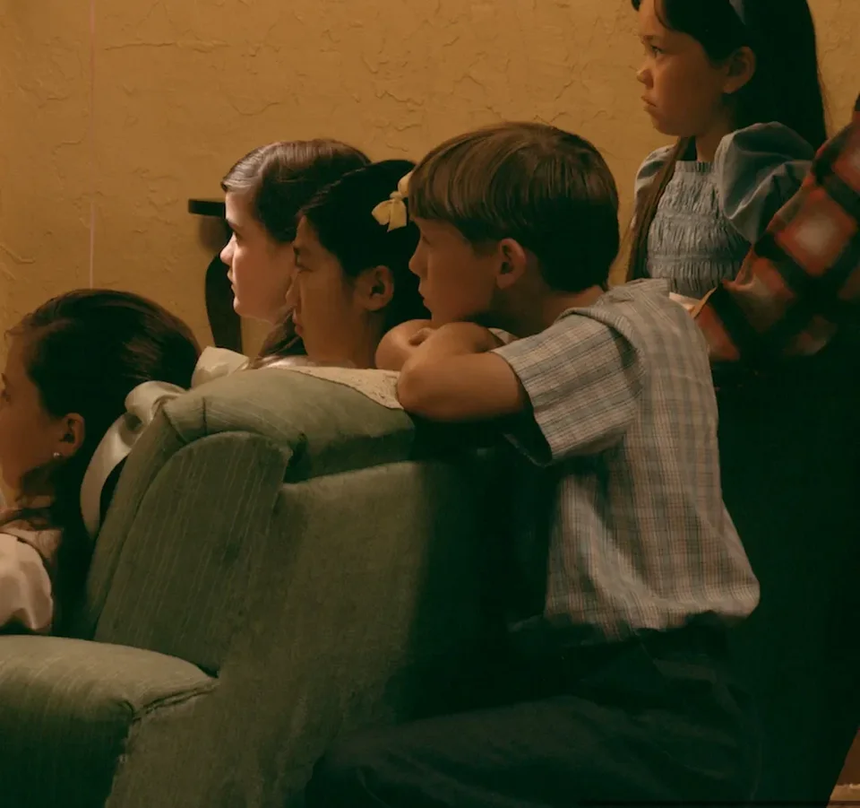
For example, look at this little boy. Look at the relationship between his head and his back. Isn't it strange? How could a normal person twist their head around like that? Try it yourselves: no matter how you stretch your neck, you can't get it like that. Only in one case, if your neck is broken, or if your neck was never attached to your body. Because his back is perfectly straight.
Anything else off? A great deal, actually; every detail is off. For example, the two figures to the left of the boy with the abnormal neck: where exactly are their heads? Think about it: can this cramped space really hold so many children? And why is there light only on her face, while the girl next to her has none? They're so close together; how could only one of them have this cool-toned light on her face? Don't forget, the tone of the whole scene is warm, and her face is the only place in the entire scene with cool facial lighting.
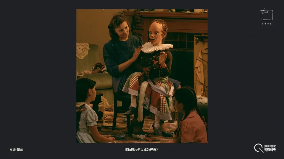
And we haven't yet mentioned that the ventriloquist performer herself is off too. Did anyone notice the problem?
No normal person could hold this pose. First, look at her legs. We're all sitting on chairs now, and our thighs should be parallel to the seat. But her legs slope downward, which means she's sitting at a slant, or the chair itself is tilted. Could she stay seated like that?
Second, did you notice his two legs are different lengths?
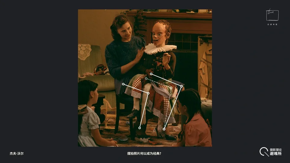
Let me mark it: the solid lines are where the image tells us the legs are, and the dashed lines are where a normal person's would be. You'd think her left leg would have to be twenty or thirty centimeters longer than her right for her to take this pose. Her knee should absolutely not be able to be in this position.
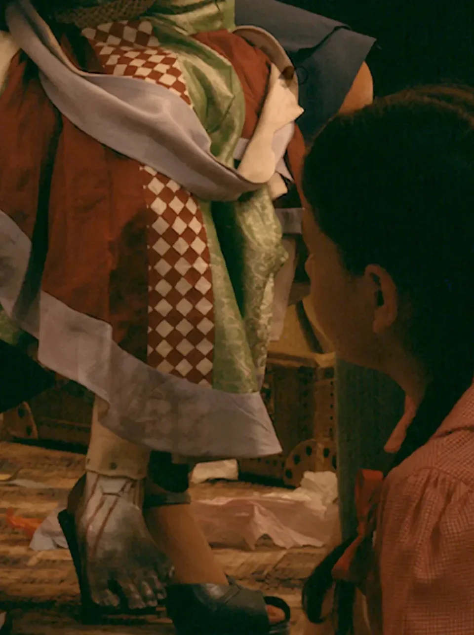
Audience member
Her exposed knee shows she's wearing a skirt, but her left foot shows she's wearing long johns or trousers.
Guosen Chen
Great observation. I hadn't even noticed the end of a trouser leg showing at her ankle.
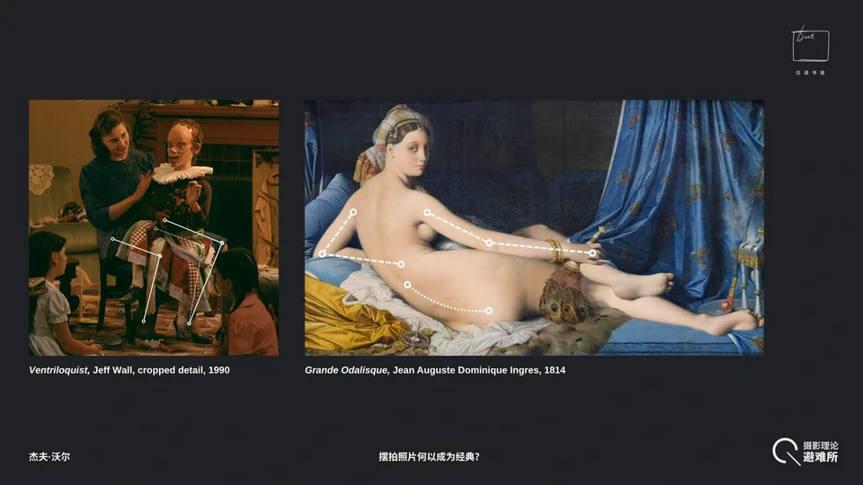
This way of handling disproportionate limbs actually has precedents in the painting tradition. For example, in Ingres's Grande Odalisque, to make the curve of her back more beautiful, Ingres deliberately added three extra vertebrae to her spine. And we can clearly see that the odalisque's left and right arms are different lengths; the extended right arm is obviously longer. Jeff Wall's deliberate alteration of limb structure is very similar in technique to Ingres's, but the aesthetic effect achieved is the complete opposite: one makes you feel the beauty and elegance of the human body, the other makes you feel the uncanny and spine-chilling.
4.5 The Balloons and the Problem of Light Sources
The most complicated thing about this photograph is the question of light sources.
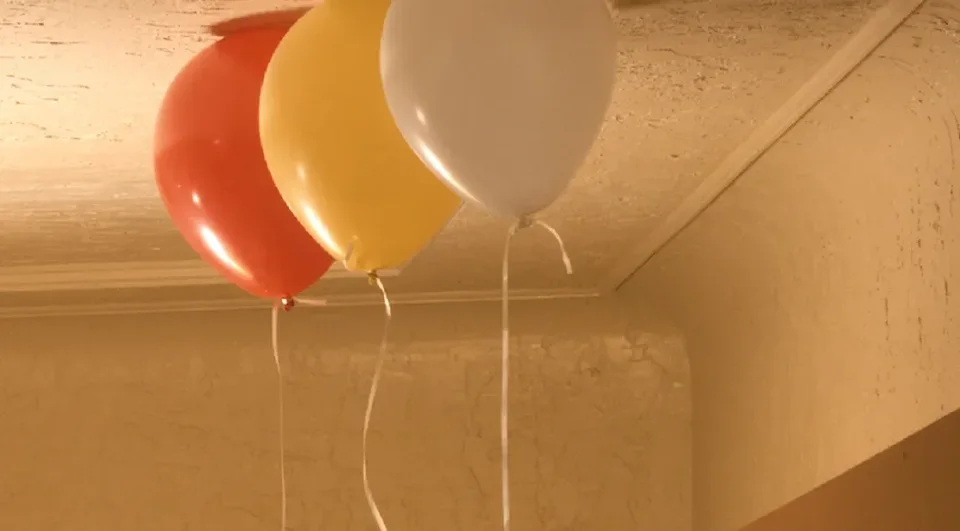
First, common sense says those two lamps alone could never light the whole room this brightly. Yet according to the image, the distribution of light seems to follow its optical logic. We can try to match the lamps with the highlights on the balloons and see whether the picture's logic agrees with real-world logic, or whether there's a conflict.
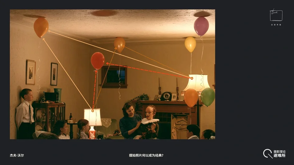
By the picture's logic, the lamp on the left corresponds to the highlights on these three balloons; the floor lamp on the right corresponds to the highlight at the bottom of the red balloon and one on the right.
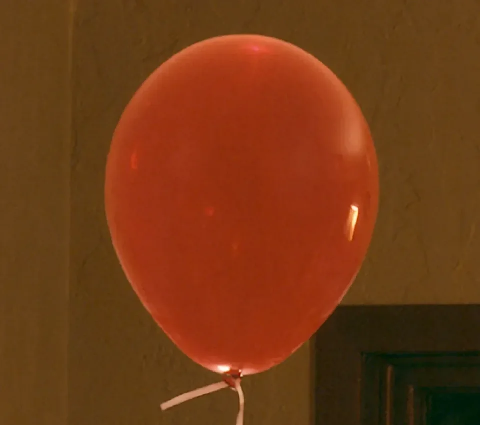
Especially the red balloon: if we zoom in, you'll find that the highlight on its right side actually mirrors the shape of the floor lamp's shade. This was very likely Photoshopped in afterward too, because no light source could reflect its own texture onto a balloon. I suspect every balloon's highlight is wrong. This red balloon has a rim light, and rim light can only appear if there's a light source behind it.
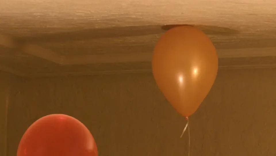
Second, the yellow balloon to the upper right of the red one has two shadows. Where do they come from? The other balloons all have only one shadow. This shadow indicates a light source far from it and at a very low angle of incidence, stretching it long, the way a person's shadow is stretched at sunset. But you can't see this light source in the picture.
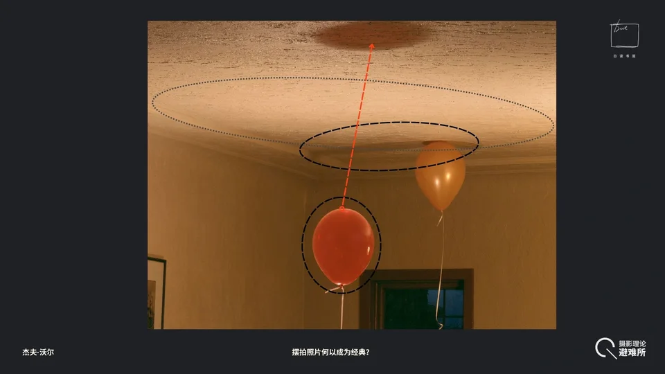
In fact, if you actually put all these balloons in this scene, none of the reflection points on them could possibly look like this. Not to mention, how could you find a point light source like a table lamp (by the nature of the balloons' reflections, it would be a point source) that, shining on a balloon, would show its own shadow? It's impossible. So I think every single balloon is wrong.
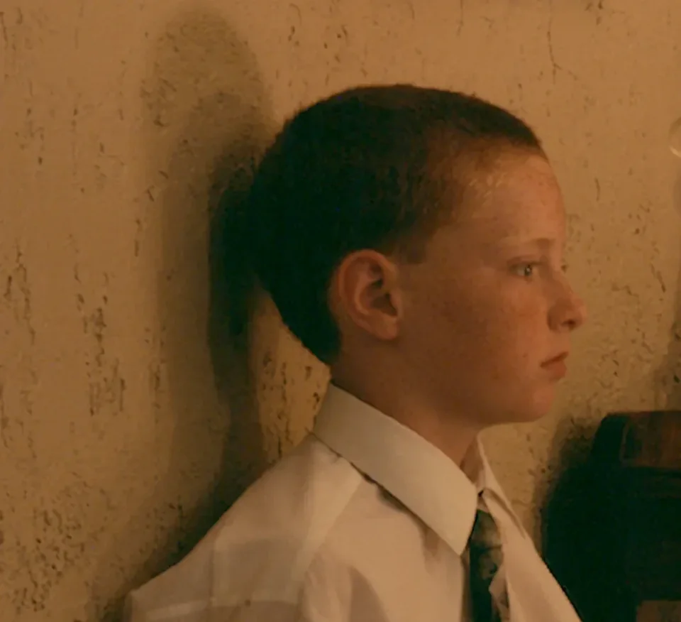
Another problem: look at the little boy's shadow. He has three shadows, but we see only two lamps in the picture. So there must be more than two lamps used in this scene.
Another fun thing: this little boy is wearing clothes much too big for his age. This further confirms that (one of) the themes of the Birthday Party photograph is anachronism: such a small child already wearing an adult's clothes. And the artist has deliberately folded up his sleeve and pressed it between his waist and the wall, so it looks as though he has no hand.
4.6 Other Details and Intertextuality
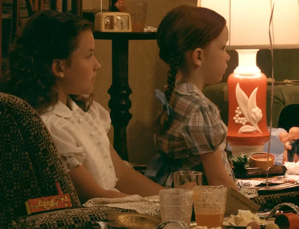
Then there's the little girl on the right. By the perspective, she couldn't possibly be here, because the space is so narrow there's simply no room for her.
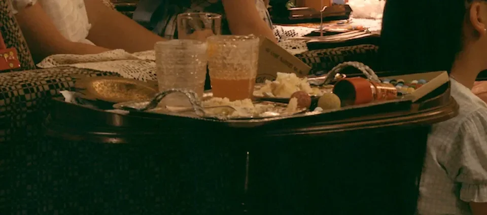
Now look at this table. Anything wrong with it? This plate tilts upward like this, and this side tilts up too. It's a V-shaped tabletop, yet the surface of the liquid in the plate is level. That violates basic physics. There's a lot in this photograph that defies physical common sense.
Another interesting spot is the rug, which is wrinkled here. A rug like this gives the impression of long neglect, or of a place where no one has moved around for a long time. If there were really a party going on, someone would surely have straightened these things. Unless none of them are alive, in which case it doesn't matter.
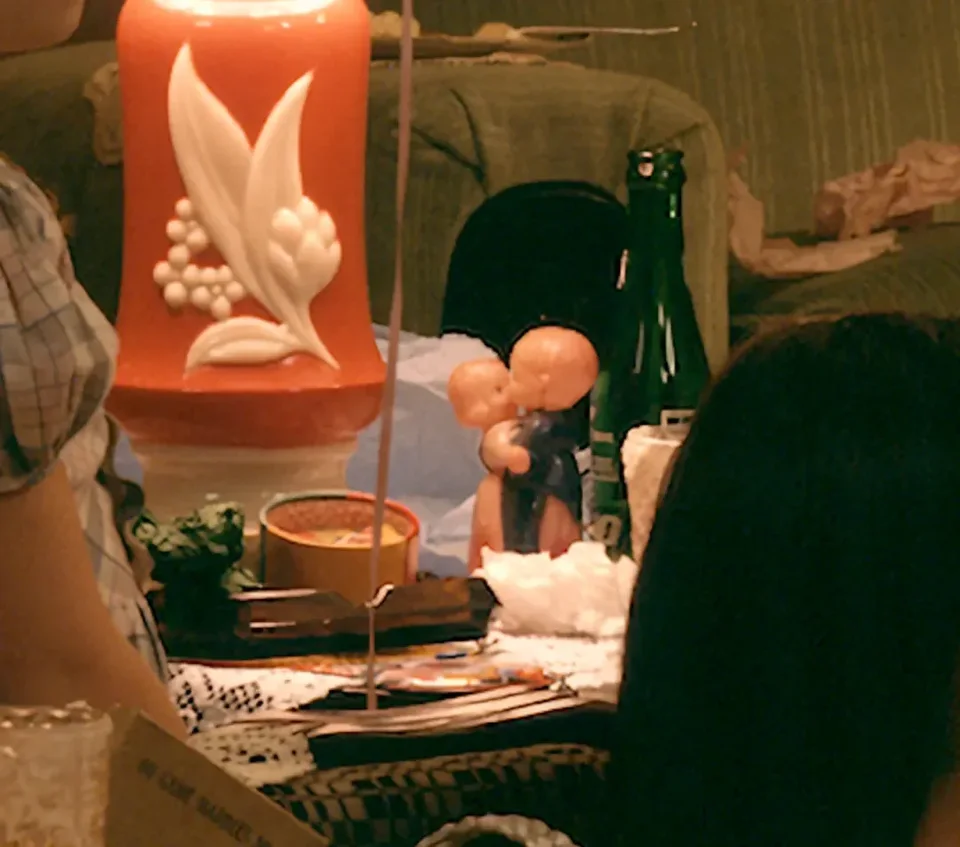
There are many small details, like this pair of kissing plastic dolls. This is the only intimate contact in the room. But the intimacy is plastic and childish. It forms an intertextual relationship with the grotesque pairing at the center of the room (the ventriloquist and the wooden dummy). I think there are many such intertextual relationships, for example on the mantelpiece behind the ventriloquist. Look at the portrait of an old woman on the right side of the fireplace, watching everything happening in the room. This echoes the Voltaire-like dummy: the dead watching the living, the dead (the dummy) speaking to the living.
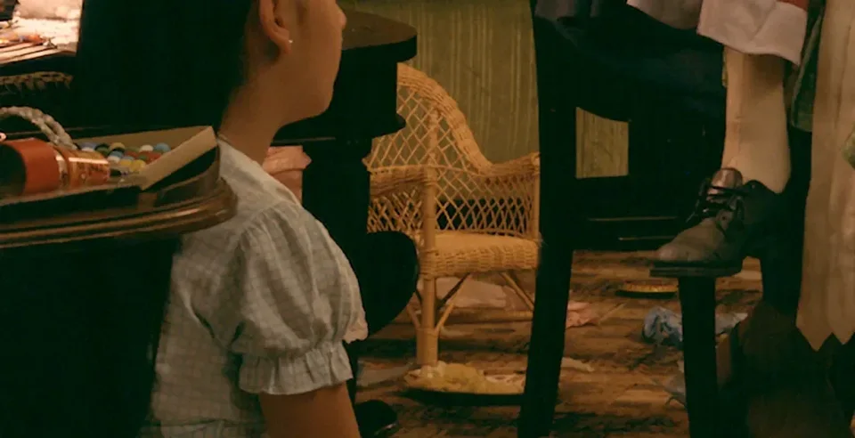
Then there's this cradle in front of the green sofa. Especially within the large picture as a whole, it feels eerie. Who is it for? Is it doll furniture? But what doll would use it? No doll in the picture fits this little lounger. The human chair is occupied by a giant dummy, while the doll's little rocking chair sits empty. In this room, the doll has grown huge and, like a person, sits on high ruling over everything (think about the geometric arrangement of the whole photograph, and this Voltairean face and expression, to say nothing of everything else the Enlightenment stands for), while the place that originally belonged to the doll (the little chair) has been abandoned in the corner. The doll is no longer content to sit in that chair. There doesn't seem to be a single biologically human being in this photograph, whereas the doll enjoys a very high status.
4.7 Theme II: Sound and Silence
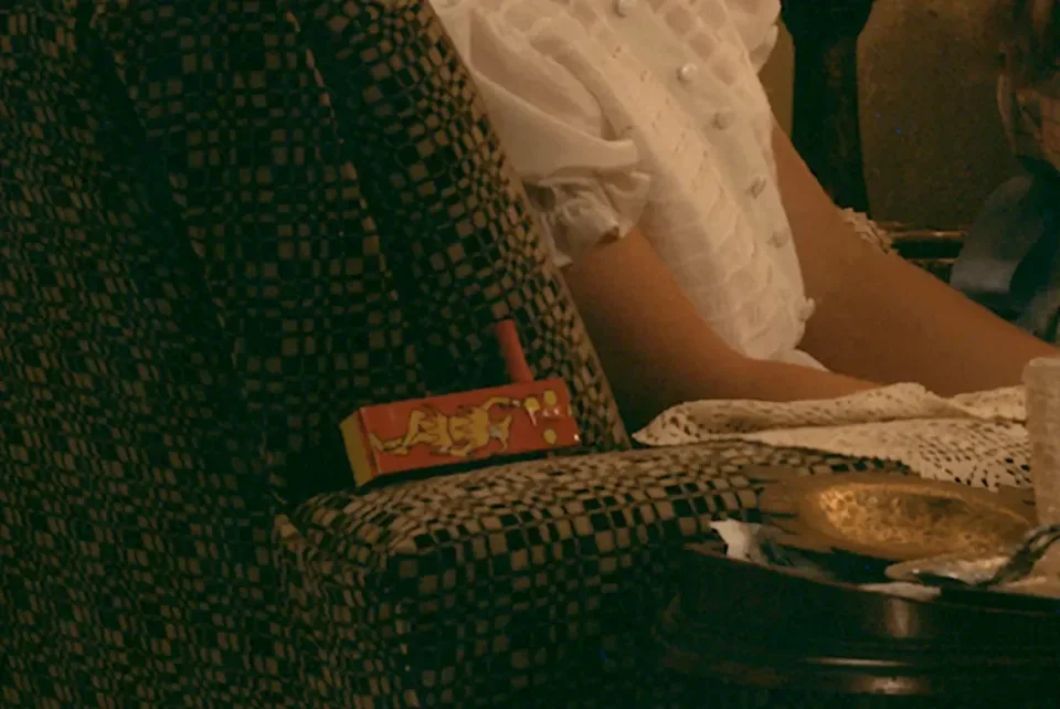
Then there's this thing leaning against the sofa, with a clown painted on it. It should be a ratchet noisemaker, a classic party toy: you hold the handle and spin it, and the wooden slat slaps against the gear, making a loud clacking noise.
This actually gave me an idea: from another angle, we can look for what in this photograph can make sound and what can't. In other words, besides time, as the title ("ventriloquist") suggests, another extremely important theme of this photograph is "sound and silence." The ventriloquist is supposed to perform ventriloquism, which requires making sound. But all the children watching the show sit obediently, completely silent, and all their expressions are very solemn.
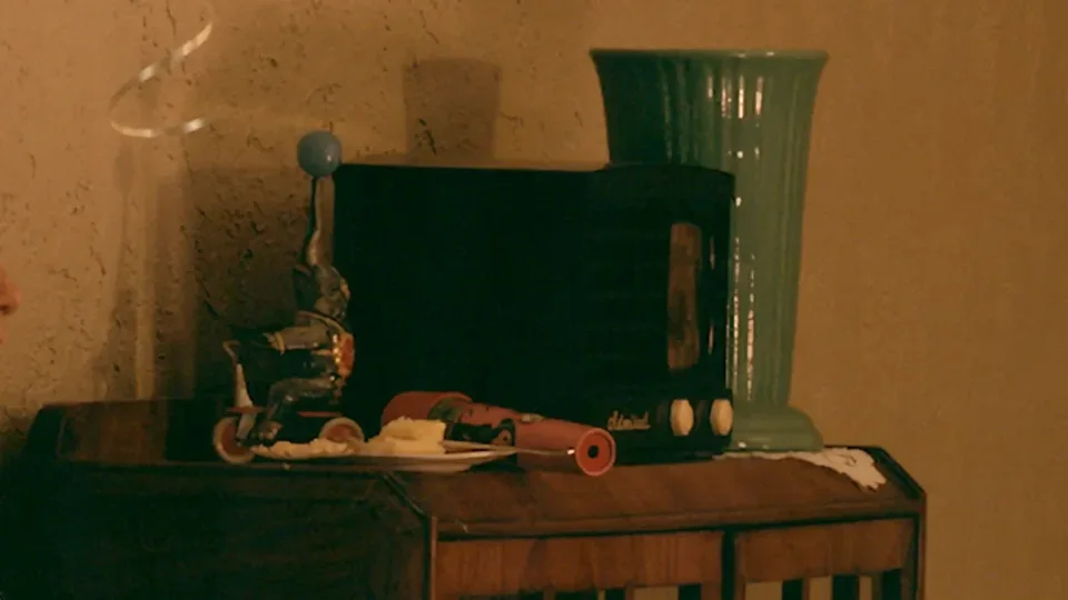
Following the thread of sound, we can also notice a black Admiral radio (the Admiral brand?) on top of the tall cabinet on the left, an iconic object of the 1940s. A radio is "voice without a body." Ventriloquism, by contrast, is the art of "borrowing a body to produce a voice." This radio is undoubtedly silent, and the noisemaker we just mentioned is silent too. The noisemaker's function is to "make noise," yet at this moment it just lies quietly on the arm of the sofa.
So this photograph is extremely eerie; there's so much you can't explain. But it's precisely these inexplicable things that keep you looking at a photograph like this, turning over in your mind what on earth is going on and why it is the way it is.
We're about out of time, so let's end today's talk here. If you'd like to discuss anything else, we can chat informally afterward.