
Ce Zang
Hello everyone, I'm Ce Zang, today's host. Welcome to the Huxi Commune Cloud Dinner. This is the 12th session of our interdisciplinary seminar "Contemporary Imagery: Paths and Possibilities." Today's topic is "On the Display of Contemporary Photography: The 'Tableau Form' in the 'Another Avant-Garde' Exhibition."
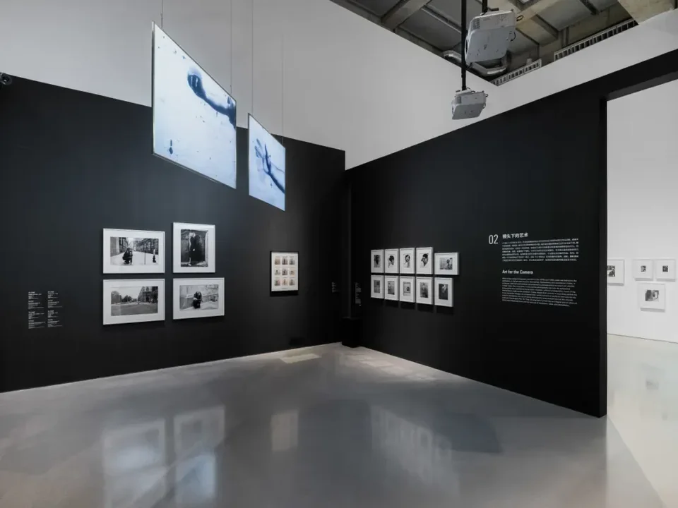
Friends in the art world know well that last year's "Another Avant-Garde: Photography 1970–2000" in Shanghai made a big impact and set off lively discussion in both photography and art circles. I saw the show twice and consider it very important. Today many people in photography don't actually have a clear understanding of documentary photography versus art photography. Plenty of people think that a photograph with a pretty picture is art photography, which is a serious misconception. This exhibition gave a clear account of how photography entered the domain of art in the 1970s. When it comes to the avant-garde, anyone familiar with art history knows the trajectory from the historical avant-garde to the neo-avant-garde. "Another Avant-Garde" makes us ask whether it is still possible today to open up yet another avant-garde, instead of stopping at 2000. We'll hold a series of discussions on this in the future, but we can't cover everything tonight. So we'll start from one important entry point: the exhibition's "tableau form" and its relationship to contemporary photography. We're honored to have Guosen Chen, co-founder of "Photography Theory Shelter" and PhD candidate in the Department of Philosophy of Art at Fudan University's School of Philosophy, as our presenter, and photography critic, photographer, and curator Rong Jiang as our discussant. There's a lot to share today, so let's begin with Guosen Chen's first part.
Guosen Chen
Thank you, Ce Zang, for the introduction, and thanks to Rong Jiang and all our livestream viewers. Today's presentation has three parts. Rong Jiang and I are both presenters. We'll each present a section in turn and carry on a dialogue that way. Without further ado, let me begin.
Today's keyword is "tableau form." The term tableau comes from French, and in photography it refers specifically to a distinctive mode of display that arose after the 1970s. The Chinese rendering juxfu changmian xingshi, "large-scale scene form," was actually proposed by Rong Jiang, and it has proven very precise. Compared with renderings like "picture" or "scene," it better captures what the term means in photography. Today I'll break the phrase into three smaller words, "form," "large-scale," and "scene," and take them one at a time, about 15 minutes each. The last part may go beyond photography.
Form
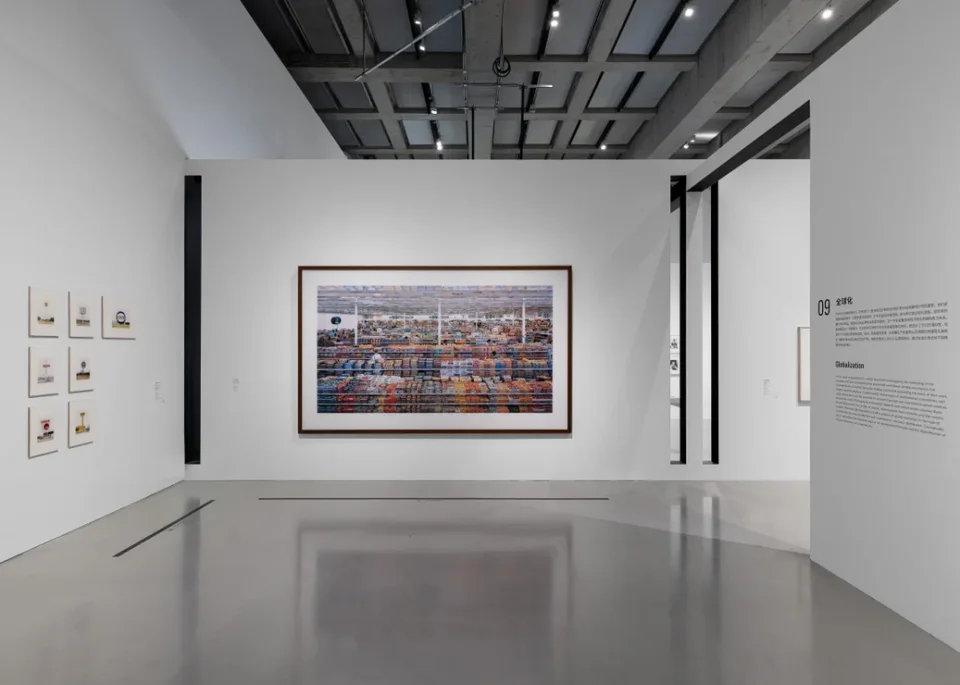
The first keyword is "form": what kind of form is the tableau form? Take last year's exhibition at the West Bund Museum. Works such as Gursky's 99 Cent are far larger than earlier photographs, reaching two or three meters. I once asked the curator why people still come to see printed photographs in person, now that phones and all kinds of screens are everywhere. After all, a high-resolution digital file can display colors and details clearly on a screen.
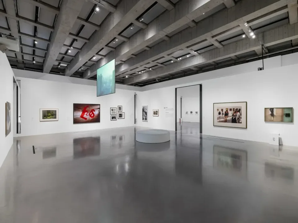
The curator explained using the exhibition's section "Photography as Sculpture." The concept of the tableau form, which runs through the whole exhibition, comes from the French art theorist Jean-François Chevrier. In "The Adventures of the Picture Form in the History of Photography," he traced the new changes in photography after the 1970s with this concept at the core. Michael Fried then took up the term and interpreted it. Although Fried used Chevrier's term, the two differ fundamentally in how they see the value of the tableau form.
In the first part I'll set out Fried's summary of this form. In the third part I'll discuss what I see as a key point he didn't consider. What kind of photograph can be called a tableau-form photograph? Such photographs can hardly be shown to best effect on small screens like phones. They need to be displayed at large scale in a museum, three or even five meters, for viewers to grasp the artist's intentions. This mode of display is irreplaceable and irreducible. At first glance these photographs may look busy, even excessively cluttered, but the effect is completely different from a small-format presentation.
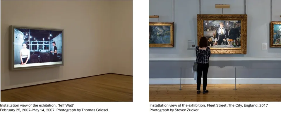
In the development of contemporary art photography, a large part of the reason the tableau form holds such an important place is Jeff Wall's contribution. Some articles also treat Stephen Shore as a pioneer of this form, but neither Rong Jiang nor I agree. Although some of Shore's photographs are very large, they are essentially different from the tableau form.
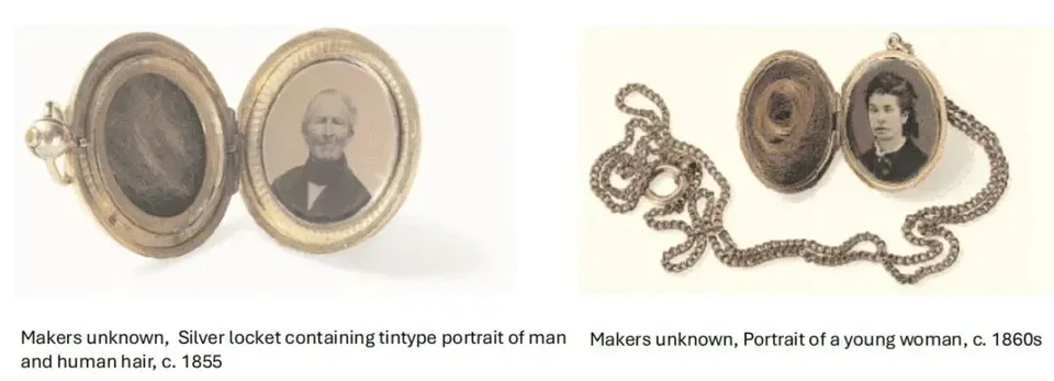
Michael Fried defines the tableau form in three respects. First, such works are made from the outset to hang on a wall, not to be held in the hand or assembled into an album. Manet's painting A Bar at the Folies-Bergère, for example, is framed and fairly large, suited to hanging on a wall. Small photographs, by contrast, emphasize an intimate connection with the viewer. They can be keepsakes for remembering loved ones, they carry social meaning, and people can give them to others as gifts.
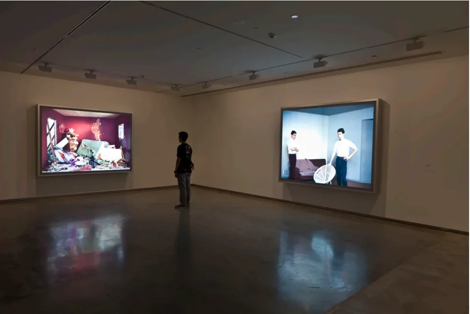
Second, once a large photograph hangs on the wall, it changes from a "transparent photograph" into a real, tangible object and produces a confrontational experience with the viewer.
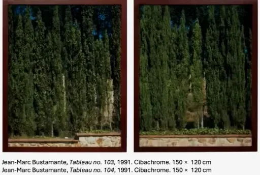
Third, once a photograph is large enough to become an object, the work intervenes as an artifact in the space the viewer occupies. Take Jean-Marc Bustamante's Tableau, which measures 150 × 120 cm. It shows a stand of trees so rich in detail that it's hard to give it a single name or define its character. Its boundaries are indeterminate. Viewers can't settle into immersive, concentrated viewing and keep oscillating between absorption and detachment.
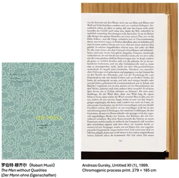
Another example is a work Gursky made in 1999 that photographs a book page, with text from Robert Musil's The Man Without Qualities. He scrambled the order of the words and removed some specialized terms. At first you seem able to read it, but gradually it starts to look like gibberish. In other words, it isn't a transparent page that invites you to look through its surface as an image to read and understand its linguistic meaning. It is simply a picture.
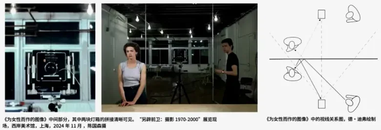
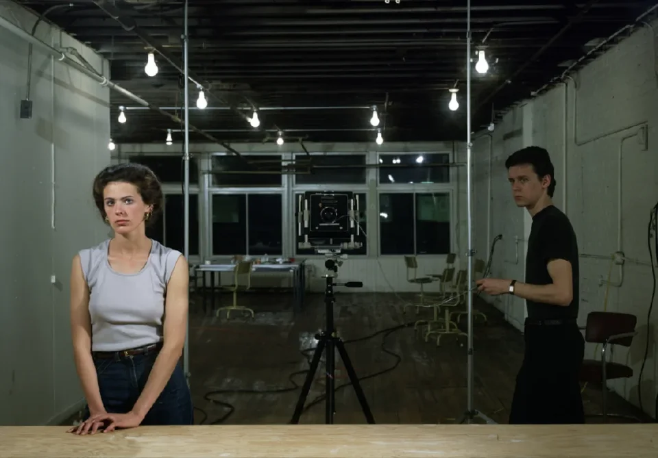
One more point: Jeff Wall's Picture for Women has a seam running down the middle that splits the "camera" in the image in two. Together with the evident thickness of the lightbox transparency, it reminds viewers that this is not a "transparent photograph" but a real object.
Those are the three basic features of the tableau form, as summarized by Michael Fried. Put simply:
- It is prepared for wall display from the moment it is made.
- It forms a confrontation with the viewer instead of seeking continuity.
- It intervenes as an object in the viewer's space and declares that it is not a transparent photograph, so viewers can no longer immerse themselves in the world it presents as they once did.
Ce Zang
Thank you, Guosen, for that concise overview from the standpoint of form. I'm currently writing a rather challenging, speculative essay, and in it I lay out my own understanding of form. Form must connect with human perception. It can't be merely a matter of novel styles. Strictly speaking, something detached from the human perceptual system doesn't count as true form.
Take the question of what counts as "large-scale." Scale is measured against our bodies. Half a meter might be large for a child but small for an adult. Front and back, left and right, up and down are all concepts based on our bodies. This is the basic principle of Merleau-Ponty's phenomenology of the body. That's all I'll say for now.
Next, Rong Jiang will approach the topic from the history of photography exhibitions, forming an organic connection and exchange with what Guosen has said. That's an important feature of tonight's session. Please go ahead, Rong Jiang!
How Display Helped Establish Photography as an Art Form
Rong Jiang
Many thanks to Ce Zang and Guosen. Guosen just explained, from the angle of photographic theory, how display, and especially the tableau form, allowed photography to become contemporary photography. I'd like to talk about the history of photographic display, especially at the Museum of Modern Art (MoMA) in New York from the 1940s to the present, and how its display practices helped establish photography's status as an art form.
MoMA founded its photography department in 1940 and was one of the first institutions in the world to recognize photography as an art form. Christopher Phillips, senior curator at the International Center of Photography in New York, wrote an essay in 1982 called "The Judgment Seat of Photography." He argued that, at least in the twentieth century, MoMA held the position of the "judgment seat of photography," because its major exhibitions steered photography in different directions.
Let me go into MoMA's contributions in more detail. MoMA's founding director, Alfred H. Barr Jr., held from the start that photography was a legitimate art form that could be exhibited alongside painting and sculpture. In 1937, around the centenary of photography's invention, the museum mounted "Photography 1839–1937," curated by Beaumont Newhall, a retrospective of the history of photography. In 1938, MoMA held its first solo photography exhibition, Walker Evans: American Photographs (the catalogue was published in Chinese by Zhejiang Photographic Press as American Images). The exhibition and its catalogue are still regarded as landmarks. MoMA also collected many important photographic works, which affirmed photography's value as an art form.
The first curator of MoMA's photography department was Edward Steichen, himself a photographer. In 1955, MoMA held a very important exhibition, The Family of Man. It remains one of the best-known exhibitions ever, and its catalogue is still in print. The show emphasized photography's power to record and celebrate diversity and to depict universal human experience. Many critics, however, found much to object to. The main problem was that it didn't foreground photography as an art form. It stressed photography's capacity to tell stories and convey emotion instead.
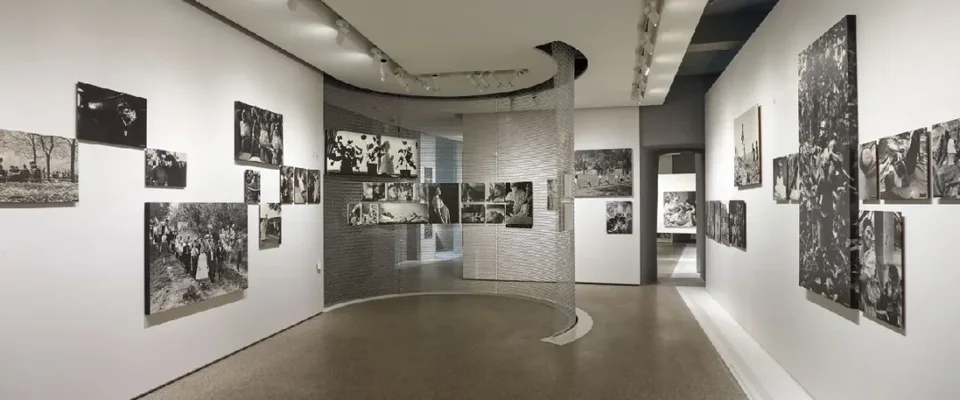
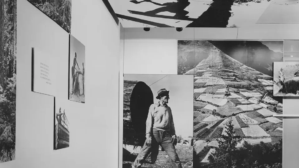
You can see this in how The Family of Man was installed. The photographs were neither framed nor matted. Pictures of different sizes were placed haphazardly, some even on the ceiling or in overlapping arrangements. This showed insufficient respect for the photographic works, and arguably for the photographers themselves. Photography became a tool for the curator to express the theme of the "family of man" and display shared human experience, and the value of the works themselves was not emphasized.
The next curator was John Szarkowski, arguably MoMA's most influential photography curator, and still unrivaled. He held many important exhibitions during his tenure, such as New Documents and William Eggleston's Guide, the exhibition of Eggleston's new color photography. These shows not only named new tendencies but also led photography in new directions. Szarkowski believed that photography had its own unique form of visual communication, its own intrinsic qualities, and its own potential for artistic expression, distinct from documentary and photojournalism. In display, he particularly emphasized the interaction between individual images and their relationships as a whole.
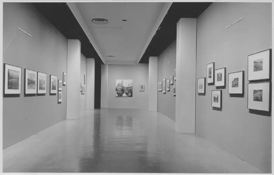
Szarkowski's first major exhibition after taking office was The Photographer and the American Landscape in 1963. The installation was fairly conventional, but every print was framed with a white mat and hung in a linear arrangement. This stood in sharp contrast to The Family of Man. It's fair to say that Szarkowski played a crucial role in using display to establish the photographic medium as an artistic medium. Presenting single photographs let viewers stand before a work and contemplate it, and it brought out relationships among works such as sequence and rhythm.
Szarkowski's successor was Peter Galassi. His main contribution was mounting exhibitions of contemporary photographic artists such as Cindy Sherman, Andreas Gursky, and Jeff Wall, all installed in the tableau form.
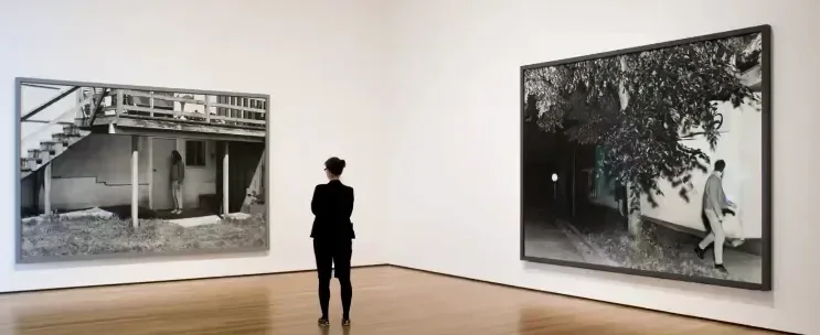
In Gursky's MoMA exhibition, for example, the works were so large that viewers had to stand quite far back to take in the whole. I went to see that show and it made a strong impression on me. Standing in front of one of Gursky's five-meter-long works, I felt very small, even swallowed up by the work. That feeling was very different from traditional display.
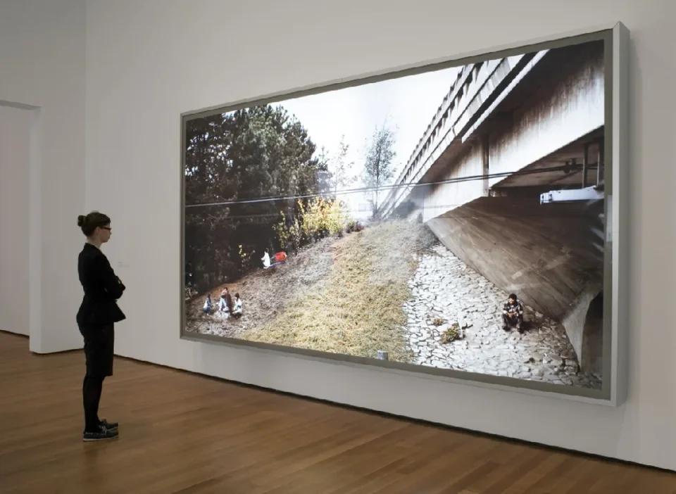
Jeff Wall's exhibition used lightboxes at an even larger scale. One work hung up near the ceiling and looked like a billboard. MoMA went from Szarkowski's conventional presentation of single framed prints to Galassi's tableau-form exhibitions of Jeff Wall and Gursky, and after those two shows photography was established as a major form of contemporary art.
I'll stop here, as a response to Guosen's question of what the tableau form of display is. Ce Zang, please take over as host.
@Ce Zang:
Thank you, Rong Jiang. Rong Jiang curated the Stephen Shore exhibition in Lishui, and when we chatted recently we noted that the poster outside the museum was huge, a different size from Shore's original prints inside the show. My impression after seeing it was that the poster formed the kind of relationship with my body that Guosen described. It was like an installation, a huge standing object, different from what you see once you enter the museum. The two speakers will presumably discuss later why Shore's photographs aren't enlarged, which is a very interesting question. Now let's have Guosen's second part.
Large Scale
Guosen Chen
My second part centers on Jeff Wall's A Ventriloquist at a Birthday Party in October 1947. I want to talk about why a work like this has to be shown so large, and use it to lead into our third part. This mode of display isn't just about enlarging a photograph. There's something more important behind it.
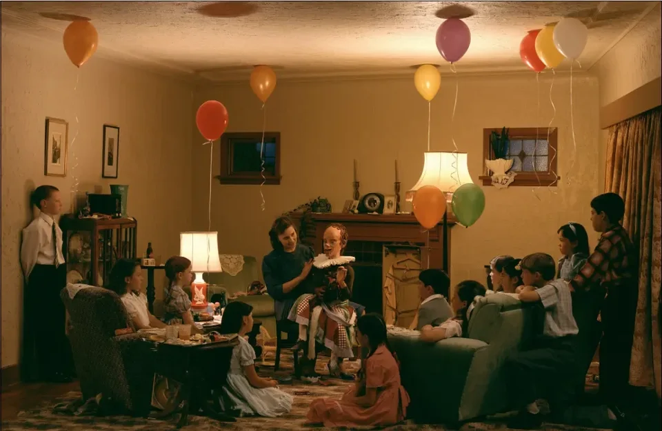
Look at this photograph first. Does anything strike you as off? It seems like a heartwarming scene, and the title tells us a ventriloquist is performing for children. But look closely and you'll notice several things.
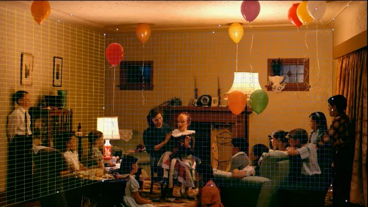
- A contradiction between viewpoint and space. The camera is clearly positioned above the children and the performer, roughly above the performer, and at the geometric center of the image. Yet the wall seems to recede to the left, which you can sense even without guidelines. When I built reference guides for these four planes in Photoshop, a red warning appeared as soon as I had set the top and right planes. It was impossible to construct a coherent three-dimensional reference system for this space, which means the space contains errors.
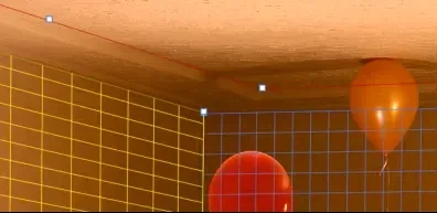
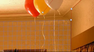
Specifically, the seam where the ceiling meets the two walls isn't the usual right angle. The corner should be in one place but has shifted slightly to the right, and at one point the wall suddenly has a strange inward indentation. The junction between ceiling and wall doesn't meet normally either. The whole room feels tilted, yet the viewpoint is frontal. That's the first strange thing.
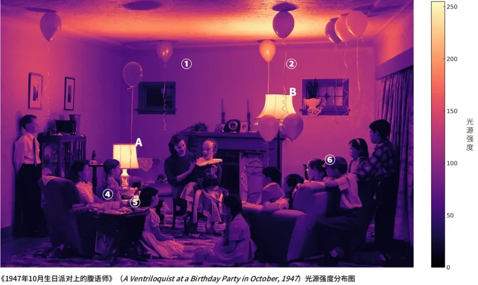
- The uncanny distribution of light. On the surface, only two table lamps provide light, but the shadows on the balloons reveal a problem.
The areas the lamps (marked A and B) cast upward are obvious (the yellow areas). But the shadow of the balloon marked "2" above is very crisp, even though it lies outside the upward throw of the lamps. The shadows look as if a distant point light source were shining up from directly beneath the balloons, producing hard light with such sharp outlines. Moreover, the balloons sit at different distances from the light sources, yet their shadows are almost equally sharp. Whether light is hard or soft depends on whether the source is a point or an area source and on its distance, so this clearly isn't physically plausible.
Take one balloon: the two specular highlights on it are equally intense. But once you estimate its distances from lamps A and B, that equal intensity makes no sense.
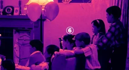
The little girl marked "6" has strong light on her face. But if the people on either side of her are really pressed up against her, why does only "6" catch the lamplight? There's no highlight at all on these people's heads. Why? It doesn't add up.
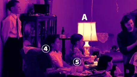
The clothes of girls "4" and "5" are fairly bright and you can see reflections on them, but "5" herself shows almost no reflected light, which is also strange.
I have a friend who also works in academia, Linzi. She's very clever and perceptive, and she told me about anomalies she had noticed. Let me relay her observations on her behalf:
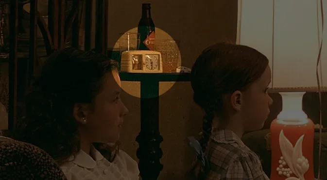
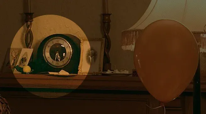
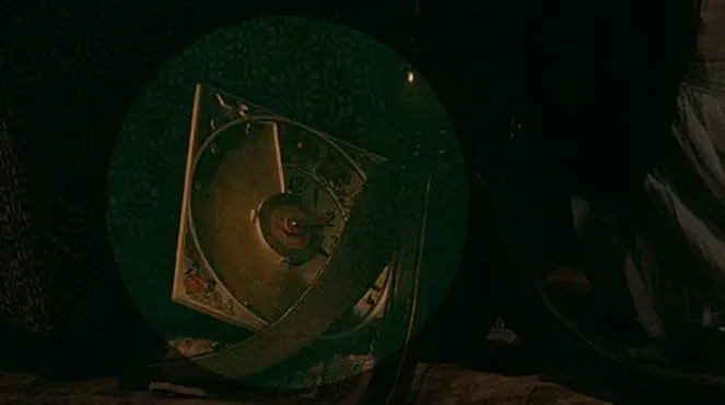
First, the times on the three clocks contradict each other. Look carefully and you'll find three clocks in the image, all showing different times. On the leftmost clock, the hour and minute hands overlap at the six o'clock position. Setting aside what time it is, how could the hour hand exactly overlap the minute hand at the 30-minute mark on a working clock? The middle one is fairly clear and shows about 5:32. The lower one looks like two o'clock, but it doesn't even look like a functioning clock. So what time and space are these people in? We can't know.
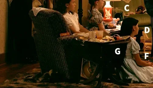
The floor is covered with scraps and litter, and the table is covered with food, but it looks more like leftovers than a feast you'd enjoy at a birthday party. The floor is also very uneven. Would we tolerate a floor like that at home? It would easily trip people, so it wouldn't normally be allowed. And clothes are piled carelessly behind the sofa, with no one paying attention.
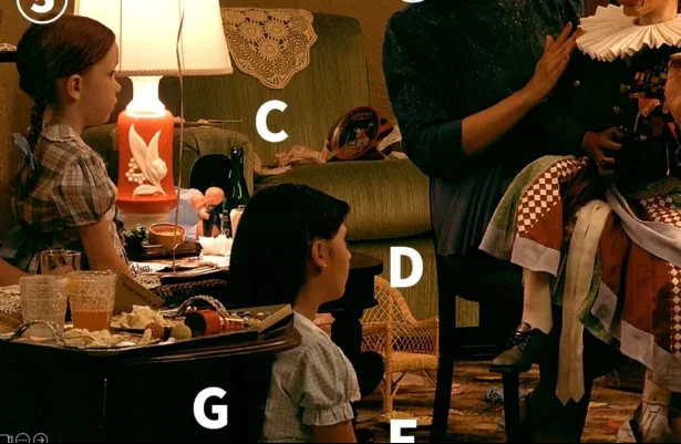
Then there's sofa C, which sags inward, though sofas in everyday life are generally flat. How could anyone lie on a sofa like that? One could even imagine a case where a corpse sank into the sofa and lay there unattended for a long time. When the body was removed, the sofa kept a strange V-shaped deformation from bearing its weight for so long. Linzi also noticed that, in terms of perspective, the little wicker chair isn't on the same plane as the other objects in the scene. Look at the whole image: it belongs to no one present and doesn't look like a pet item either. It's a very strange presence.
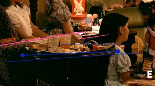
Now the tray and the table: they aren't on the same plane either. If you draw a horizontal line along the tabletop, you'll see it has a clear slant. It looks a lot like the tabletops in Cézanne's still lifes, such as Compotier. Even if we assume the middle is level, the two ends clearly tilt upward, and the tray has thickness on both sides. None of it makes sense.
Then there's the part marked with pink lines. Given the sofa arm as it appears, the middle and right portions hidden behind the tabletop and cups should line up with the extension of the left side (the long pink line on the left). After all, you can clearly see the lace cloth draped all the way across. But where the sofa back reappears on the right after being obscured, it is noticeably lower (shown by the short pink line on the right), as if it had been cut off with a knife at a certain point. The design of this sofa arm is utterly implausible.
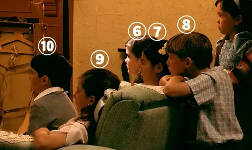
Next, the figures. Girl 9 seems to be sitting on the sofa with her arm draped over its back. But girl 7? Only her head shows, and it looks as if it has been forcibly pasted in between girl 6 and boy 8. There's no way to infer where she is. And boy 8: when would a normal person's neck look like that? Even if he were sitting bolt upright, or leaning his whole body forward to see the performance, he wouldn't take such an implausible posture. Basically, unless his neck were broken, his head could not jut so sharply forward while his body stays perfectly upright. It's as if his neck had been wrung and his head then artificially pushed forward and fixed in place.
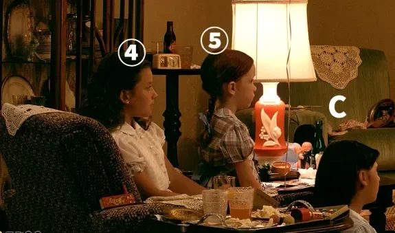
Girl 5's position is also very odd. You can tell girl 4 is sitting on the sofa, but girl 5 clearly isn't sitting on 4's lap, since 4 is leaning to one side and 5 is obviously behind her. Yet if you picture the spatial relationship between the sofa and the table, there's simply no room for girl 5. If her head is roughly level with girl 4's and she's sitting neither on the sofa nor on 4's lap, there's only one possibility: she's floating in midair!
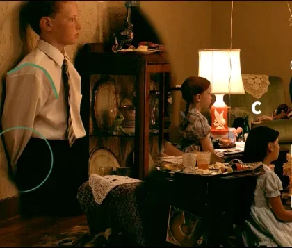
Linzi also pointed out a detail, one of the first things she noticed. The little boy is wearing a suit that clearly doesn't fit him. It's far too big. Look at the outline of his shoulder: there's a very unnatural crease. When a normal person wears clothes, the fabric at the shoulder falls smoothly along the arm, but here it drops off abruptly. He also seems to have his hands behind his back, but there doesn't seem to be a hand there at all. By inference, he's like a mannequin with broken arms in a clothing store, dressed in an oversized garment. Otherwise his arm couldn't look so uncanny. It feels as though there's no arm inside at all.
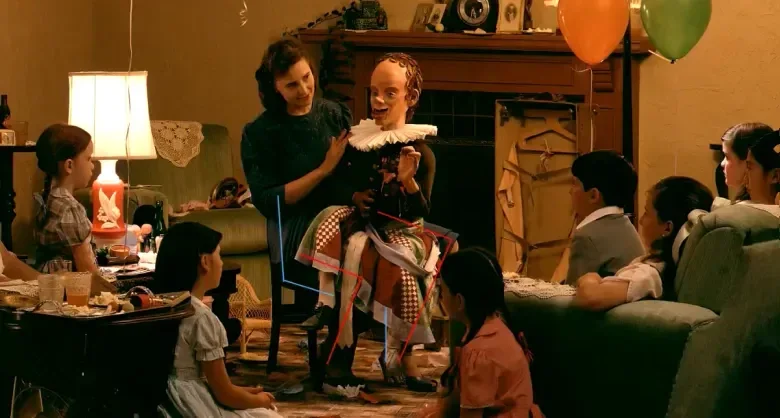
The dummy at the center of the photograph is also very strange. Its right foot is charred black, its left foot seems to be missing, and it wears no shoes. The hem of its dress is filthy, as if it had been retrieved from a garbage heap.
The eeriest thing is the relationship between the ventriloquist and the chair. As the blue lines indicate, the seat slopes steeply downward. For the ventriloquist to sit on it in this posture, as the red lines representing her legs show, her left leg would have to be much longer than her right. That doesn't fit the perspective of normal human limbs at all. The chair is also missing a leg: where I marked in blue is where a chair leg should be, but it's blocked by the dummy's legs and the ventriloquist's. So how does the chair hold her up steadily?
When Linzi finished telling me all this, my hair stood on end. Remember that this work belongs to the same series as Wall's Dead Troops Talk and The Vampires' Picnic, a relatively self-contained series in his career devoted to the living dead. These people look alive but have actually been dead for a long time. In Dead Troops Talk, for instance, all the soldiers are dead, conversing in a space whose order differs from that of the living. A Ventriloquist at a Birthday Party in October 1947 is the hardest of the three to interpret. You have to look very carefully to realize that, even if it isn't a scene of the living dead, it is at least a surreal space, and the people in it have very likely been dead for a long time. They aren't normal humans.
Linzi told me that the most interesting thing about these photographs actually isn't the parts that can be decoded.
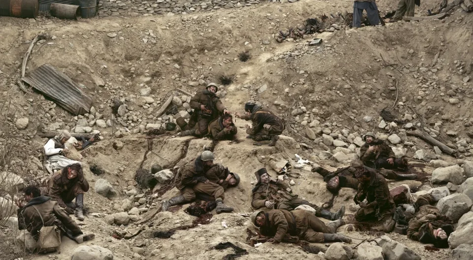
In Dead Troops Talk, for instance, the dead are chatting. Some have lost legs, some their heads, and an Afghan (the man in white on the left) is stealing from the dead soldiers. He is alive. But a pair of legs also appears in the upper right, and we simply can't tell whether they belong to the living or the dead.
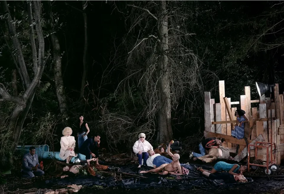
The same goes for The Vampires' Picnic. The Black vampire in the lower left holds a red high-heeled shoe that belongs to no one present, and where he's looking there's nothing at all.
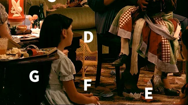
Back to A Ventriloquist at a Birthday Party in October 1947. The spot I marked F looks like a leather shoe, with implausible highlights and reflections, yet it doesn't quite look like a shoe, nor like an upturned post. However you look at it, it can't be explained.
There's so much in these photographs that can't be decoded. They aren't closed, solvable puzzles. They're more like traps set for us. Once you notice these things, you seem to fall in, because there's so much that can't be explained. These undecipherable points linger in your mind for a long time like ghosts, and that's what makes these works interesting. What's more, if you only look at a small reproduction, you'll never notice these details. Only when the photograph is large enough, and viewers move closer and farther away in front of it and look again and again, do these incongruities become visible. That's the distinctive effect of the large-scale photograph.
That concludes my second part. Many thanks to Linzi for sharing these meticulous observations and conclusions with me.
Ce Zang
Thank you, Guosen. The second part was brilliant, a "close reading" and analysis of the image. While listening, I suddenly thought of a Picasso painting whose title I've forgotten. It shows a heavy-limbed woman sitting by the sea. If you look closely, the horizon behind her isn't level from one side to the other, which is fascinating, and the elements don't belong to the same moment in time either. It took me a long time to notice that. Now, Rong Jiang, over to you.
How Display Helped Establish Photography as an Art Form
Rong Jiang
Thank you, Ce Zang and Guosen. The anomalies Guosen described are precisely the hallmarks of Jeff Wall's work. They can be described with Freud's term "uncanny." The uncanny refers to sights or scenes in human experience that evoke shared human memories, scenes that strike us as eerily strange. The details Guosen discussed could only come to light because of the tableau form. The work Guosen just discussed was made by photographing several shots with a large-format camera and then compositing them in Adobe Photoshop, and Wall may have deliberately left some telltale seams to show that the work is staged and constructed. Still, I wouldn't have noticed if Linzi and Guosen hadn't pointed them out.
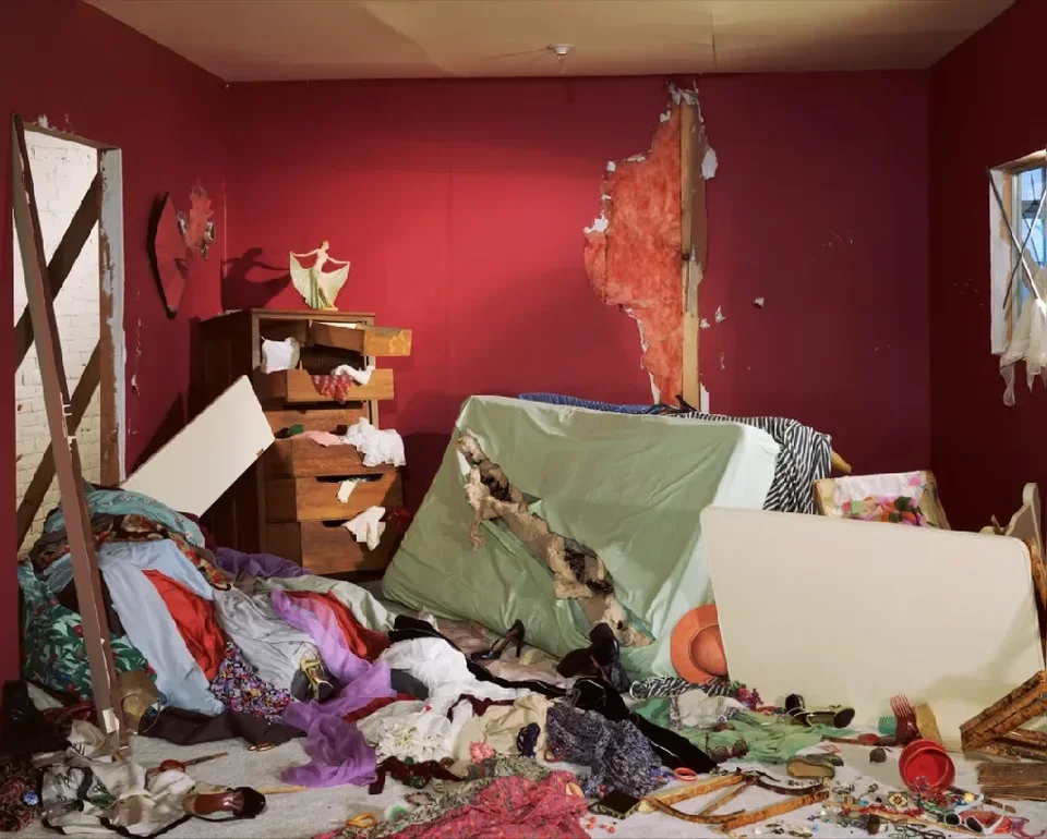
The Destroyed Room, made in 1978, brought Jeff Wall international fame. The work was conceived after Delacroix's painting The Death of Sardanapalus. A characteristic of Wall's work is that it takes history painting (paintings inspired by historical scenes and stories) as its basis. He conceives works after history paintings and transposes them into modern life. The Destroyed Room looks chaotic and violent, but the placement of every object in it was carefully thought out, eliminating chance. Eliminating chance is another hallmark of Wall's work. He no longer shoots on the street. Instead he observes, keeps interesting scenes in mind, and then restages them before editing and compositing them in postproduction.
I'd now like to introduce the work of three contemporary photographic artists, Jeff Wall, Thomas Ruff, and Andreas Gursky, to draw out some characteristics of contemporary artworks, including the tableau form of display we've been discussing. Each of these three artists was inspired by a different event and adopted a different way of working.
In the 1970s, after seeing Velázquez's monumental paintings in a museum in Spain, Wall kept wondering how photography could achieve that effect. Later, seeing a lightbox advertisement at a bus stop, he had a sudden epiphany and decided to present his work as lightbox transparencies. From then on, he presented most of his works that way, for example Picture for Women.
Let me insert a digression here. Translating "picture" as tuxiang (图像) is fine, but in China "image" (yingxiang, 影像) is also commonly translated as tuxiang, which makes it hard to distinguish the two, even though they are different. A tuxiang is drawn, or is a magazine or newspaper illustration, a television picture, and so on, something related to painting. A yingxiang is a photographic work, or something generated by computers and digital postproduction. Flusser specifically discussed the technical image in a 1986 essay. So "image" must be translated as yingxiang and "picture" as tuxiang.
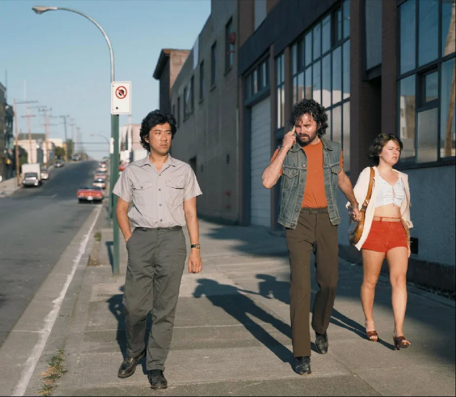
Jeff Wall's work isn't snapped like Cartier-Bresson's "decisive moment," though he has his own decisive moments. In Mimic, for example, a white man mocks an Asian man's eyes with a hand gesture, and the scene is staged.
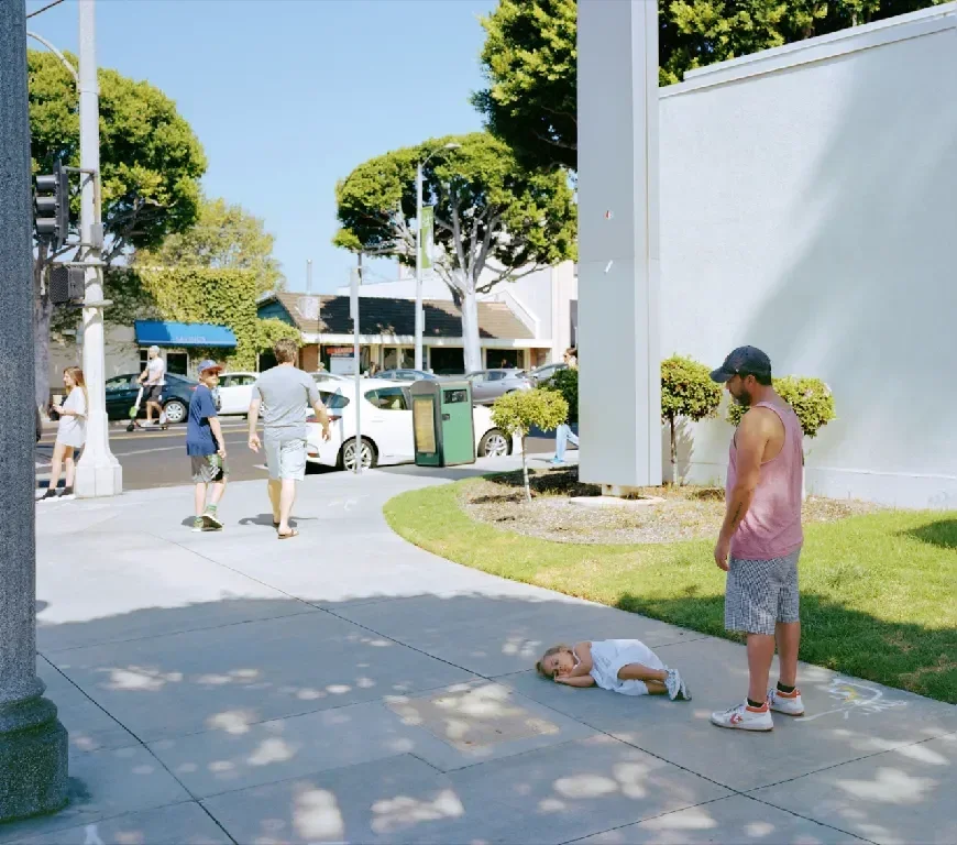
The same holds for Wall's 2018 work Parent Child. A child lies on the ground throwing a tantrum, a very common scene in everyday life, which gives the illusion of a snapshot, but every detail was carefully designed. In the distance there's another father and child, the father walking ahead and the child looking back, while bystanders go about their business. Presented in the tableau form, it instantly evokes our collective memory.
Wall chose lightboxes not merely for visual effect but to explore the tensions and problems of modern society: between photography and film, photography and painting, photography and the advertising-driven consumer society. That's why he has been hailed as a "painter of modern life" in Baudelaire's sense, an image-maker of modern life.
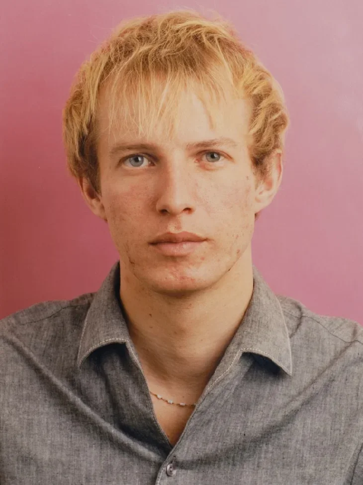
Thomas Ruff also had a moment of epiphany. In the early 1980s he was keen to revisit the portrait style of August Sander, famous in the history of German photography. After World War II, few people had pursued that direction in portraiture. Ruff wondered whether portrait photography could really capture a person's inner world, or whether it could only stay on the surface. With this question in mind, he began photographing his classmates and friends. At first he shot profile portraits and gradually moved to frontal views. The backgrounds were uniformly front-lit white or colored, and the sitters wore plain clothes and expressionless faces, like enlarged passport photos.
When this series was first exhibited, the prints were small, about 11 × 14 cm. Viewers seeing them would call out the names of the people pictured, "That's Peter," "That's Mary." They weren't treating them simply as photographs but were focused on the people in them. This reaction set Ruff thinking. Later he enlarged the photographs to two meters, and the effect changed completely. Viewers had to stand at a certain distance, and their attention shifted from the people in the photographs to the form of the photographs themselves.
In 1986, Ruff photographed with a large-format camera from an objective, eye-level angle, keeping a certain distance from his sitters, whose faces remained impassive, and then presented the works typologically. The series made Ruff internationally famous, and later some critics argued that it captured the typical image of Germany's postwar generation of young people.
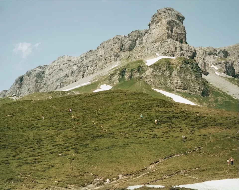
In the early 1980s, Andreas Gursky traveled in the Alps and saw a spectacular ski slope. At first he had no intention of photographing it, but he was captivated by the view. Urged on by a friend, he set up his large-format camera and took the picture. When the film was developed, he was surprised to find people on the slope in the photograph whom he hadn't been able to see with the naked eye. This accidental discovery made Gursky realize the power of the large-format camera: it can capture minute details in the distance, even ones the eye can barely perceive.
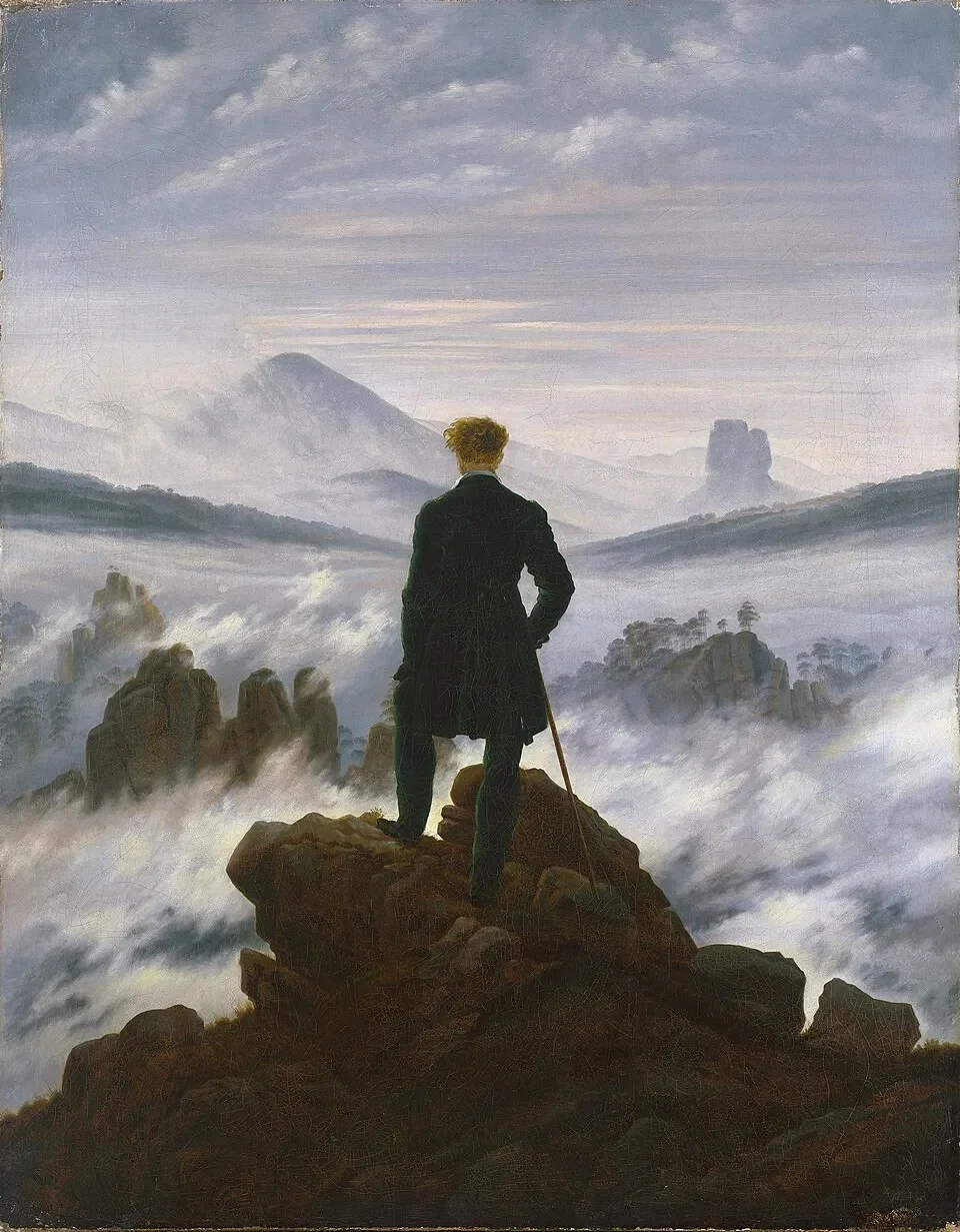
He was also inspired by the German Romantic painter Friedrich's Wanderer above the Sea of Fog. With its distinctive viewpoint, the painting shows the autonomy and subjectivity of the individual after the Enlightenment. The viewpoint is almost a God's-eye view.
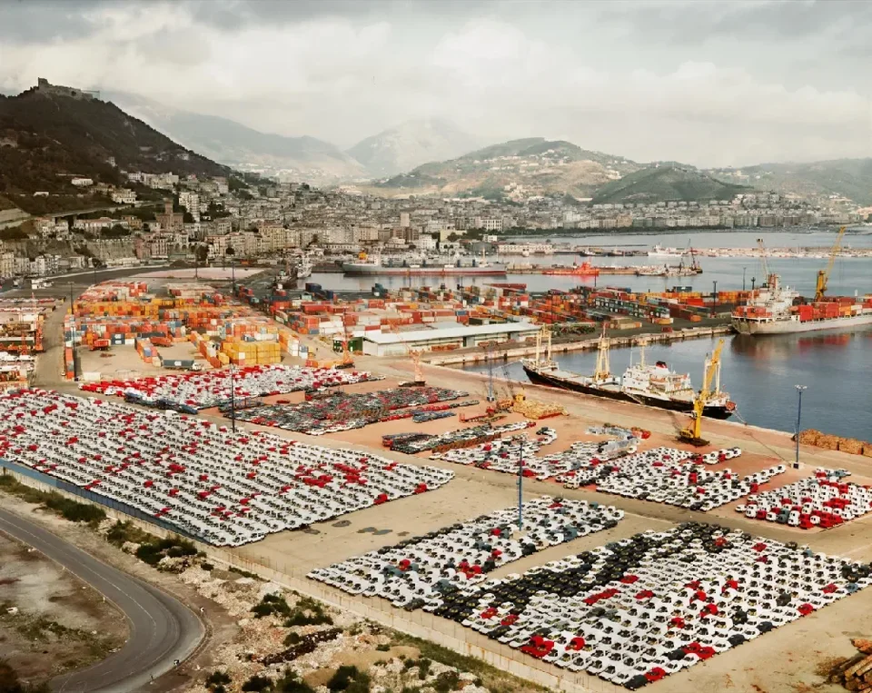
Drawing on these inspirations, Gursky made a series of works on the theme of globalization. Shooting from above with a large-format camera, he recorded scenes around the world in the tableau form, such as cars packed densely in huge parking lots. 99 Cent was shot in a 99-cent store in Los Angeles. It wasn't taken in a single exposure but composited from several large-format shots, similar to the way Jeff Wall's work, mentioned earlier, is made.
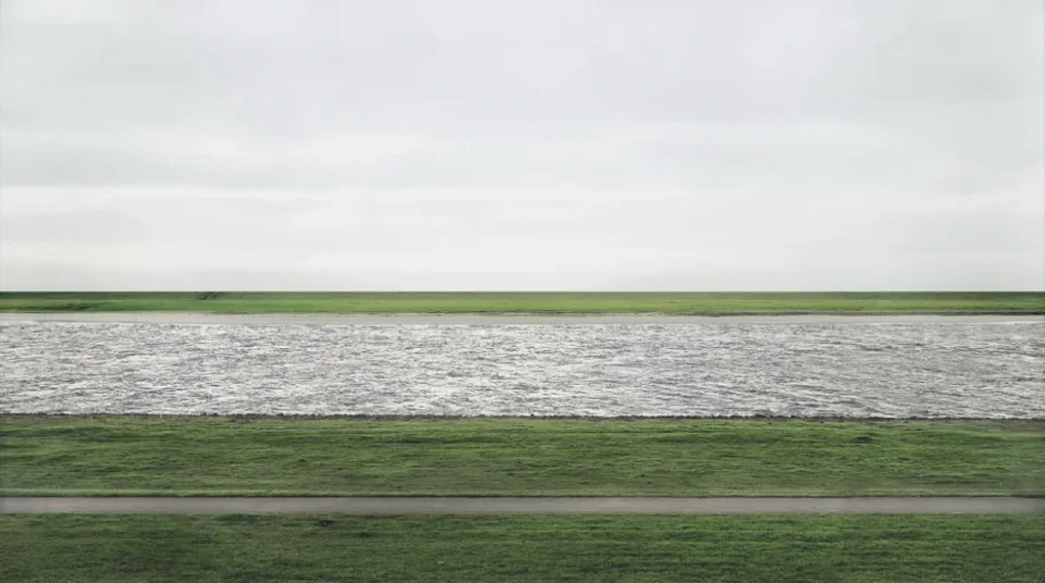
Gursky's later works became increasingly abstract. Rhein II (1999) set the record at the time for a photograph at auction, selling for millions of dollars. It shows an ordinary stretch of river he often passed while jogging, with buildings, factories, and smokestacks in the background and pedestrians in the foreground. He processed it in Adobe Photoshop and removed the clutter and buildings, so the final image resembles an Abstract Expressionist painting, with interwoven lines and fields of color, five meters long and two meters high. The subjects of Gursky's work determine that he must present them in the tableau form. In recent years his style has grown ever more abstract, as in Bauhaus (2020).
Let me sum up some basic characteristics of contemporary photography:
- The mode of creation shifted from street photography to staged shooting after careful conception in the studio. This effectively eliminates chance from the work, which is crucial.
- The tool shifted from snapshots with a 35mm camera to slow shooting with a large-format camera. Robert Frank shot with a 35mm camera, and his work has a distinctive viewpoint and blurred details. Jeff Wall, Gursky, and Ruff, influenced by Shore and by Bernd and Hilla Becher, chose to work with large-format cameras.
- Work moved from the darkroom to the "camera lucida," with extensive use of digital postproduction.
- In presentation, works are displayed at large scale. From a catalogue alone it's hard to feel the works' overwhelming effect. You have to see the originals to experience that visual impact.
- Contemporary photography shows a trend toward mixing media, with increasingly diverse modes of creation and presentation.
- Photo-based works have emerged. Whether performance, installation, or another art form, anything output as photographs falls into this category.
- There's also a trend of returning to traditional craft. Some photographers make unique handmade works, called "the retro avant-garde." The American photographer Sally Mann, who combines large-format cameras with the wet-plate process to make documentary or art photographs, is a typical example.
- Contemporary photographic artists actively engage with questions in contemporary society and culture and keep exploring the boundaries and plasticity of the photographic medium. Their works are full of contemporaneity and the spirit of the times.
That's all for my second part. Ce Zang, please continue. Thank you!
Ce Zang
Thank you, Rong Jiang! Rong Jiang's second part and Guosen's second part fit together perfectly. Excellent! Let's keep things moving. Guosen, please go on with your third part.
Scene
Guosen Chen
Thank you, Rong Jiang, and thank you, Ce Zang. My third part picks up an important point Rong Jiang mentioned: after the 1970s, contemporary photography gradually turned toward studio-based staged photography. That's the core of what I'll talk about.
Chevrier used the word tableau to describe this turn, and its essence lies in the values behind studio staging. The core is the photograph's "constructedness," and this quality was part of the category of the tableau from the very beginning, not something that appeared later. Rong Jiang said earlier that Shore's photographs differ from the tableau form, and I'd like to offer one way of explaining that.
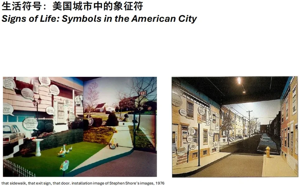
The exhibition Signs of Life: Symbols in the American City included many of Shore's photographs, which were very large. Some even exceeded the size of so-called tableau-form photographs. But they differ fundamentally from what we're calling the tableau form. The key point is that Shore's work isn't organized around the studio and the production of "constructedness" in the image that the studio brings. Why have this constructedness at all? It serves a specific purpose. I wrote to Shore about this, and he replied:
"I have never really attempted to make prints at the scale of Andreas Gursky's. The size of the Signs of Life prints was determined entirely by the needs of the installation itself. The largest prints I have made are from the Details series (2017–2020), at 48 × 64 inches (121.92 × 162.56 cm)."
In his view, the difference between his work and that of Gursky and others is that Gursky's works "overwhelm" the viewer, whereas his own work asks viewers to actively invest their attention, and even to carry that attention into life beyond photography, to construct mental images.
Although that exhibition came only a year or two before the tableau-form photographs, the fundamental aims of the two are entirely different. To understand the difference, we need to look at the relationship between "constructedness" and the tableau, so we have to go back to Chevrier's original text on the concept.
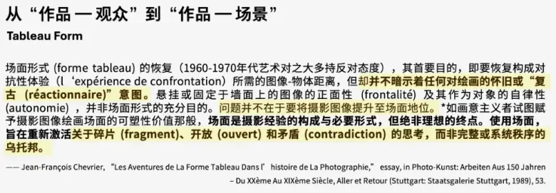
Michael Fried quotes this passage, but I think his use of it is problematic. Chevrier says that the recovery of the tableau is not meant to raise works to the status of painting. The English translation renders tableau as "painted" instead of keeping the original word, whereas the French text uses tableau. The word has many meanings. In English it's also translated as "picture," and in Chinese as tuxiang (image), tupian (picture), changjing (scene), and so on. The key is the last sentence. Its values lie in "reactivating a way of thinking about the fragment, openness, and contradiction, rather than the utopia of a complete or systematic order." Fried's interpretation, however, places it back within the tradition of absorption and uses it to build his argument about the separation between the world of the photograph and the real world. I think that strays somewhat from the original meaning. In effect, it assigns the tableau back to a utopia of complete and systematic order.

Take the most general meaning of tableau, "scene." Roland Barthes said that in theater the tableau implies a "geometry of seeing." It means marking out the visible boundaries on stage, so that the audience sees only what lies within them. That's why staged photography is also called "staged photography." Barthes also said there must always be a "fetishist" who cuts out the tableau and draws its boundaries. What's on stage is constructed to begin with. It doesn't exist naturally, waiting to be photographed and enlarged. Without a process of construction and staging, no tableau can form, because that would mean there is no act of cutting and fixing boundaries according to rules.
The clearest explanation of the word tableau I've found so far is in a footnote on page 12 of Foucault's The Archaeology of Knowledge. Dong's Chinese translation renders it as tubiao ("chart" or "table"), but Foucault's French original uses tableau. Foucault asks whether a tableau, in every sense of the word, is not formally a series of series.
That is the core meaning of the tableau. It resembles Lessing's "pregnant moment": movement on stage is frozen into one moment, so it is at once a moment and a unity, able to contain the whole story, even deeper meaning, in a single instant. Such a moment is hard to capture in a spontaneous snapshot. It has to be constructed.
Jeff Wall says his works aren't "documentary" but "near documentary," and in representing reality he considers this approach superior to pure documentary. Take Mimic, which Rong Jiang mentioned. Wall deliberately seized on a tiny gesture to show how racial discrimination is felt in everyday life. The reactions the gesture elicits are complex, not a simple binary of discriminator and discriminated. The target may not notice at all. The Asian man himself may not be aware of the discriminatory gesture behind him, and the woman beside the man making the gesture seems oblivious, or pretends to be. This ambiguity is hard to explain clearly. It's like the murky, inexpressible feelings you encounter in daily life. In such a tableau, through construction, Wall condenses a complex social phenomenon into a scene that functions as a "series of series."
This is something Fried didn't address, and I have two articles devoted to it, one coming out at the end of the year and another under review. Through this constructedness, through fixing boundaries and cutting out scenes, contemporary art photography no longer relies simply on content to express themes such as politics, gender, and class. In the past we treated these themes like objects in a container, replaceable and removable, but art photography after the 1970s doesn't work that way. Take Jeff Wall's breakthrough work Picture for Women, which uses the plural "women." Wall, Gursky, and others like to create photographs by manipulation and staging precisely because they want to reconstruct scenes in the studio and achieve the condensing effect of what Foucault calls a series of series, so that viewers grasp the scene's wholeness and complexity in an instant.
Diderot's account of the tableau was very influential. He too said that the flow of the human mind, a person's worldview, is nothing but a succession of tableaux. Our memories are similar: though fragments, they have sufficient unity. Speaking loosely, this is close to the fragment of the German Romantics and to Benjamin's concept of the "constellation" (Konstellation): unity achieved within fragments, where the fragment itself has unity without canceling the meaning of the cluster. For theorists today, only through the tableau can the social relations of production they inhabit be internalized visually, instead of being represented as content, because gender, class, and politics are themselves the conditions of the image's production. So the tableau isn't simply about enlarging the picture. It must be combined with construction and staging to ensure control over the image.
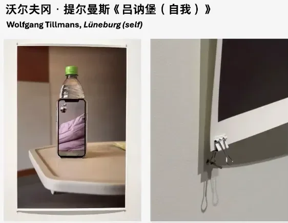
Finally, let me take a photograph by Tillmans from the exhibition as an example. It's about two meters tall, very large, but it isn't a "tableau form." Its display is unusual: a single sheet of paper, clipped at the edges with binder clips and held by nails driven into the wall at an angle the artist specified. The photograph shows a very ordinary, unconstructed scene: a video call during his COVID-19 quarantine at home. In the small window on the phone you can see him taking a selfie with a DSLR, and you can also see the space behind him. Just because it's large and hung on the wall doesn't make it a "tableau form."
According to Fried, the criteria might be size, the way the work is hung, and the way it's viewed. In short, the relationship between work and viewer. But the core concern of the tableau form isn't the relationship between work and viewer. It is the relationship between the image and what it represents, that is, its referent. The stage draws boundaries not only to fix the viewing–viewed relationship between audience and stage. The tableau form emphasizes the connection between the image and the staging behind it. So I think Fried's reading of Diderot's concept of the tableau in Absorption and Theatricality leans too heavily on the relationship between viewer and work and is somewhat one-sided.
Those are my still-immature thoughts, and I welcome everyone's criticism! That concludes my three parts. I'll hand the time over to Ce Zang and Rong Jiang. Thank you!
@Ce Zang:
Thank you, Guosen. That third part was superb! Especially the point that a photograph's meaning doesn't lie in the content it expresses. People tend to assume that "form serves content," but that isn't so. We shouldn't simply treat things like "class, race, and gender" as content. We should attend to how these concepts are generated and to the relations of production behind them. I'm very much looking forward to Rong Jiang's response to this part. Rong Jiang, please.
How Display Helped Establish Photography as an Art Form
Rong Jiang
Many thanks to Ce Zang and Guosen. Listening to Guosen discuss Fried's and Chevrier's different understandings of tableau, some thoughts occurred to me. Let me respond to those first, then talk about why Stephen Shore's work doesn't use the tableau form.
Guosen broke the tableau form into three elements, and in fact "scene" is the crucial one. Tableau originally comes from the French tableau vivant, a vivid staged scene, usually built by a set designer so convincingly that it passes for the real thing. In the work of both Jeff Wall and Gursky, the "scene" is essential, which is why they present it in the tableau form.
As the curator of Shore's touring exhibition in China last year, I'll offer my personal view on why his work doesn't use the tableau form.
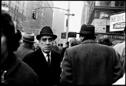
The photographs Shore took with a Leica between the ages of 12 and 16 already rivaled the 35mm work of masters like Robert Frank, Lee Friedlander, and Garry Winogrand. At 14, three of his works were acquired by a curator at MoMA. At 17, he dropped out of high school and entered Andy Warhol's studio, where he witnessed three years of Warhol's Pop Art production, which influenced him greatly. He was also influenced by the work of Ed Ruscha and the Bechers. Throughout his life Shore has kept exploring and changing his style.
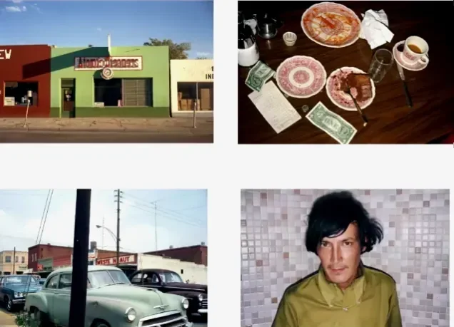
In 1971, Shore's mother died, and that same year he drove across America shooting American Surfaces. He used a near point-and-shoot camera with a built-in flash. The style looks casual but is full of subtlety. When photographing buildings, he incorporated the sky as a color element. In street scenes, he placed telephone poles two-thirds of the way across the frame to create multiple dimensions. He photographed not only buildings, breakfasts, and cars. His portraits are also outstanding, and his subjects' gazes are unforgettable. He mounted more than 200 5 × 7 prints directly on the wall in three groups, a mode of presentation that wasn't understood at the time but is now regarded as groundbreaking. Shore wasn't satisfied with this body of work, though, because the prints weren't sharp enough when enlarged, and he turned to a large-format camera for the Uncommon Places series.
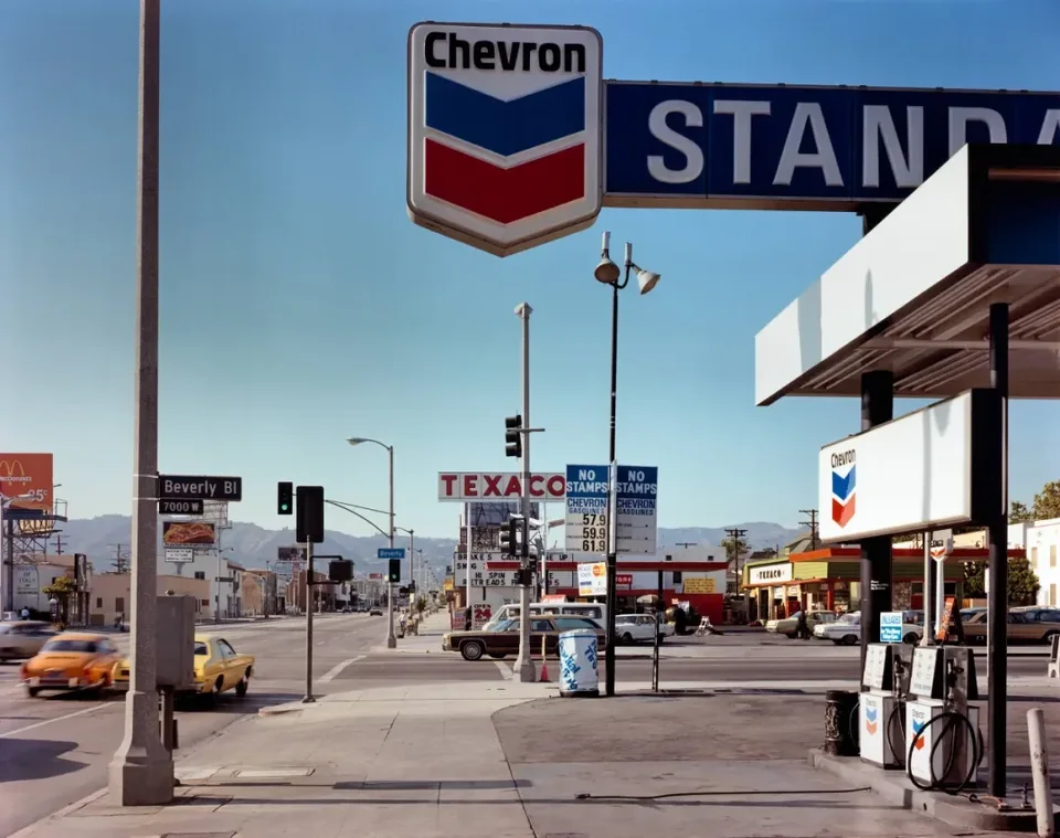
I've noticed that after his teenage work, Shore changed his approach in Uncommon Places. He no longer photographed people, street scenes, and buildings together. When photographing buildings, he concentrated on their internal structure and visual interstices. None of the telephone poles in the frame overlap. Shore observed this with his own eyes and then recorded it with the large-format camera. For portraits, he photographed only the person.
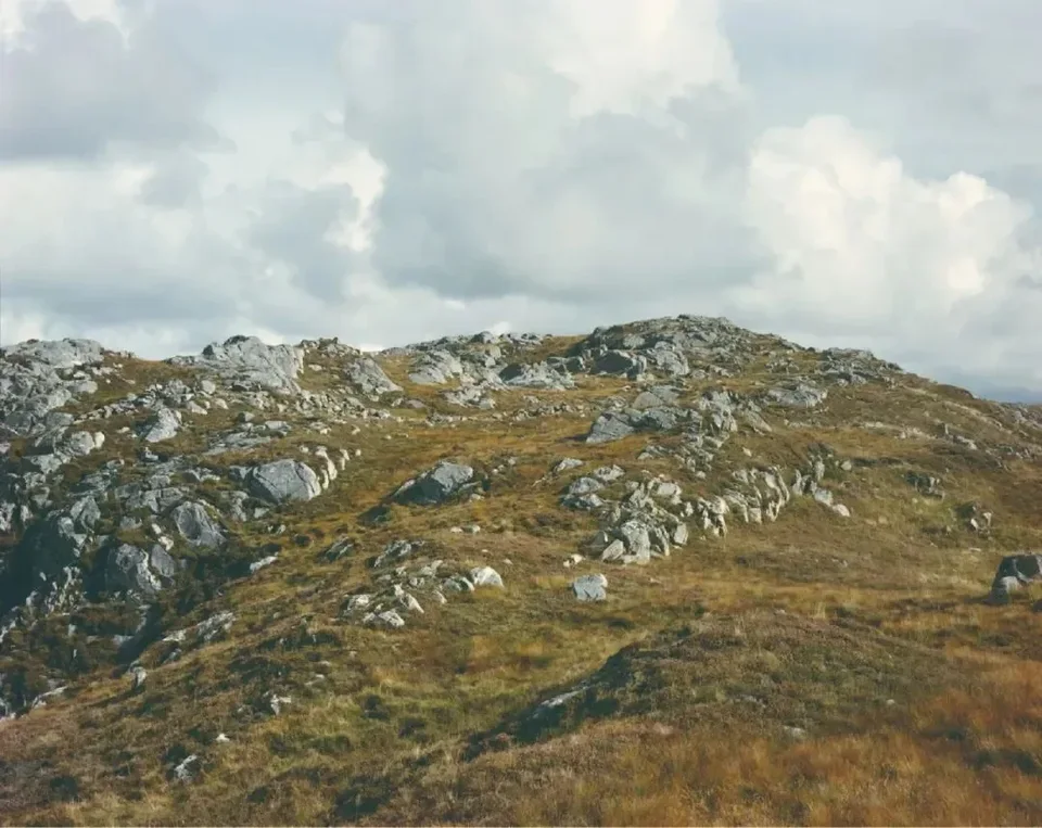
In Shore's outdoor photographs the figures are small, and he wanted viewers to contemplate the work. So the Uncommon Places prints are all modest in size, just 20 × 24 inches (50.8 × 61 cm). That's one reason he doesn't use the tableau form. At this size, viewers stand in front of the work as if looking through a window at the scenes and structures Shore points to. This is the quality of "structural transparency" in Shore's work.
Many people don't understand Shore's work. They find no dramatic scenes, big events, or decisive moments in it, not realizing that Shore deliberately avoids photographing what others have already photographed. He tried to use the large-format camera to render the pictorial structure of what he saw. This is one of his major contributions, and it influenced many later photographers working in color film. As a leading figure of the New Color photography, Shore differs from Eggleston. Eggleston shot with a 35mm camera and is also a great photographer, but he produced essentially no innovative work later on, whereas Shore's work has kept changing and innovating.
A couple of years ago, in a group exhibition of contemporary photographers organized by David Campany, curator-at-large of the International Center of Photography in New York, Shore was the only photographer who emerged in the 1970s to be included. All the others were young photographers who had emerged in the last ten or twenty years. Since his debut in the 1970s, Shore has continually surpassed himself, and his work has always had a contemporaneity that other artists of his generation lack.

Only two works from Uncommon Places have been enlarged to about a meter. One is Merced River, taken in Yosemite. Shore said he took it standing on a bridge with his large-format camera on a tripod, trying to achieve the spontaneity of a 35mm snapshot with a large-format camera, because the people in the scene were in flux. Though there was a moment of relative stillness, the picture forms a triangle: from the child at the front left, to the child the mother is leading in the middle, to the toy car in front of that child. In the enlargement, you can also see a child in front of the grass in the far distance and a dog beside it. These details are hard to make out in a half-meter print, which is why this work was enlarged. As Shore said in his reply to Guosen, he never considered enlarging his photographs to Gursky's scale for a tableau form, because he wants viewers to concentrate and linger over each work.
Even Shore's later Elements prints, at a meter, don't exceed two meters, nothing like the enormous works of Jeff Wall or Gursky. Not long ago, at the best photo lab in New York, I saw two tableau-scale prints made with Shore's permission, measuring 2.2 and 2.8 meters. But Shore won't allow them to be shown publicly. They serve only as in-house samples.
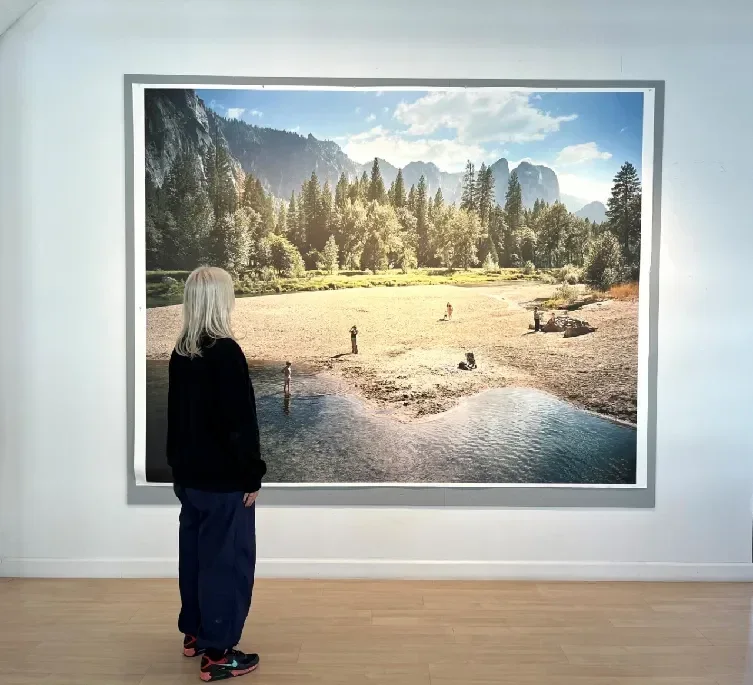
I think that at this size Shore's photographs lose their distinctive character. The pictorial structure falls apart, because at such a scale viewers can't concentrate enough to see the structure clearly. I consider this the key reason he doesn't make his photographs in the tableau form.
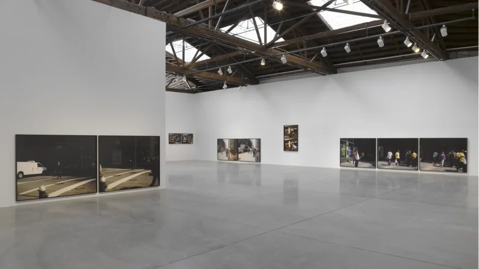
Every photographic artist must determine the right scale according to the work's subject and pictorial structure. Too large can backfire. Next, I'll introduce several exhibitions I've seen over the past ten or twenty years that reflect new changes in how contemporary photography is presented.
The British photographer Paul Graham, for instance, showed his new series The Present at Pace Gallery with the works hung close to the floor. I think this is because his work is closely tied to the street, and hanging it this way makes viewers feel that the gallery floor connects with the ground in the pictures, as if they could walk into the street.
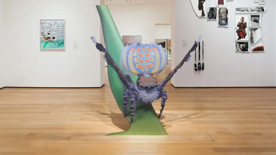
In MoMA's 2015 New Photography exhibition Ocean of Images, photography was presented in even more varied ways. It could be output as sculptural installations, among other forms.
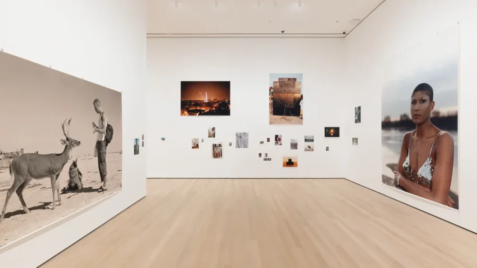
Consider Tillmans's global touring exhibition To Look Without Fear two years ago. As early as the 1990s he was juxtaposing large and small photographs, with the small ones scattered irregularly across the wall, a highly innovative approach at the time. In 2000, Tillmans became the first artist to win Britain's Turner Prize for photographic work, and the citation specifically noted that his installation methods had helped shift the direction of photography.
Today, photographic display is even more diverse. Beyond the tableau form, there's viewing through virtual reality and augmented reality glasses, interaction between viewers and exhibits, and NFT collectibles displayed on special screens. That concludes my presentation. Thank you all for your patience!
Ce Zang
Thank you, Rong Jiang! Today's two slide presentations fit together perfectly, rich in content without being cluttered. Superb.
One thing about the tableau form that especially interests me is Fried's example of Jean-Marc Bustamante's work. This question deserves discussion in Chinese photography circles. The Düsseldorf School was introduced into China early on, and many Chinese photographers were deeply influenced by it, borrowing its "deadpan" large-scale style. Interestingly, though, the "content" of Chinese photographers' work isn't "cool" at all. Lili Yang, who researches photographic theory at Shenzhen University, argued in a 2007 article that in the Düsseldorf School's work, both image and meaning tend toward coolness, and form isn't used to state content directly. When Chinese photographers borrowed the style, their images became cool too, but their meanings still ran "hot." Viewers can spot the theme at a glance, and form still serves content. These large-scale photographs changed the image's "form," but in fact they're no different from traditional documentary. You can see right through them. I've been thinking about this question for many years.
Fried's example happens to connect with the argument of the essay I'm writing, and also with the distinction Rong Jiang raised between picture and image. In Merleau-Ponty's terms, a picture consists of lines, traces, or figures given by a person, a "transfer of the body." An image (photograph), by contrast, is a transmission of signals between things. The photographer thinks he's in charge of the shot, but actually it's a transmission of signals between physical light and photosensitive material. We can't fully understand or feel these signals. In Husserl's terms, the presentation constructed by these physical signals belongs to "real (reell) content," and the part of it that can become a correlate of our consciousness belongs to "intentional content." Or consider how, looking at an old wall, we can all see figures and stories in it. That's because we project a "symbolic membrane," cast by consciousness, over the physical signals.
Bustamante's large-format works are extremely rich in physical information. Details pile up, producing something like a trypophobia effect, and they express no plot or event. It's like the two photographs Guosen showed, of trees, a street, and a fence: it's hard to read any specific event in them. The vast visual signals coming from the physical scene thus disrupt and block the "symbolic membrane" we project. In short, they are anti-symbolic.
Take Ruff's portraits, which Rong Jiang mentioned. Ruff was exploring "the portrait of the portrait": can portrait photography capture a person's soul, or does it stay on the surface of the skin? The answer, of course, is the latter. Yet critics and viewers still assign them all kinds of social meanings, saying they reflect the condition of Germany's postwar younger generation and so on. That may not have been Ruff's intention. It's our symbolic system doing the projecting. Bustamante's large-scale form, by contrast, uses physical information to disrupt our symbolic projection, so that we can't assign meaning to it.
I firmly believe that works without "meaning," works that are anti-"meaning" and anti-symbolic, have the most meaningful meaning, because they can puncture the illusions of consciousness. Our vision, our "momentary consciousness," and the "meaning" connections in our brains all happen automatically. The "truth" we think we see is actually an illusion produced by the brain's automatic projection of "meaning." There is no such thing as "seeing is believing." In my essay I propose a new concept: "the forking paths of indexicality." Photography's indexicality points not only to the real physical world but also to the gaze and intentionality the photographer invests, and it is this gaze-intentionality that comes closer to the "reality" in "documentary reality."
Fried says Bustamante's works establish a one-to-one relationship with viewers purely through physical presence. A key factor in this physical presence is scale, which produces extremely dense visual information. Far from drawing viewers closer to the work, this information, through its silent, stagnant, indigestible presence, prevents symbolic projection and creates a sense of estrangement. It even achieves a kind of "anti-symbolism" that insulates the "symbolic membrane," so that both image and meaning are "cool." This non-expressive expression of "anti-symbolism" is utterly different from the simplistic practice of treating class, race, and gender directly as content to be expressed. The latter is an illusion synthesized by the brain, and in my view a cliché. An important point for contemporary imagery is the reverse direction of intentionality: our gaze is inscribed in the physical signals, instead of physical signals merely pointing to objects to stand for reality. I consider "anti-symbolism" an important quality of large-scale display.
Now I'll invite our two guests to continue the discussion.
Rong Jiang
There was a lot today that will take time to digest, and I think we can find another occasion to continue. I'll just make two brief points. The first concerns the question just raised: why do some friends in China who shoot with large-format cameras produce work whose content leans toward a "hot medium" instead of a "cool medium"? In my view, artists like Jeff Wall and Gursky make very few works each year, perhaps three to five, and each one is carefully distilled. These works evoke images of humanity's shared collective unconscious in viewers, which is entirely different from simply recording the real world with a large-format camera. That's why, though Wall and Gursky produce few works, each one rewards repeated viewing and reflection. I'll leave my response there. Guosen, go ahead.
@Guosen Chen:
Thank you, Rong Jiang! When Shore replied to me, he specifically mentioned McLuhan's distinction between "cool media" and "hot media." My knowledge of McLuhan isn't deep, but from Shore's explanation, I sense he places more emphasis on how photography can be a way of connecting with the world in a direct, embodied way. Whatever shooting method Shore uses, and whatever pictorial structure or mental images he employs, the key isn't the photograph's mode of display or its size. He hopes viewers will treat photography as a tool for training attention, and so gain a sharper, more direct ability to observe a complex world and other people. To me this is more like the realization of a personal life experience, and it differs from the approach of Gursky and others, who place their works in museums.
When Shore does enlarge a work, I think it's to forcibly activate the viewer's perception and gaze. As your eye moves up the two-dimensional image from bottom to top, the picture deliberately crops out the clutter around the hillside precisely so that you feel the process of shifting focus. When your eyes move across a flat picture and refocus, that is in fact training your attention. So Shore's enlargements have to be understood in light of the overall aim of his work. At the end of an earlier conversation with Shore, he said that taking photographs was never about taking better photographs but about learning to live more attentively. On this trip to China, he even took pictures with his phone, instead of deliberately setting out to make "works" as before. That's my brief response. Thank you, everyone!
@Ce Zang:
Today's discussion went very smoothly. It was rich in content and prompted a lot of reflection. We're right at time, so this concludes today's presentations and discussion. Thanks to our two guests, and to everyone watching the livestream. Good night!
Special thanks to Ce Zang and Rong Jiang, to Bin Xu for Server Art's technical support, and to Xiao Zhang for preparing the transcript!